GT Pressura is inspired by metal type printing history as well as engineered letters stamped onto shipping boxes. It uses the visual gesture of ink spreading under pressure as a stylistic device, offering an alternative to more spindly typefaces of the digital age.
- GT PressuraDesigned by Dominik Huber and Marc Kappeler (Moiré). Released in 2012/2017/2022
- Available in 36 stylesTwo widths Six weights Upright and Italic Proportional and Mono
- Latin Extended, Cyrillic, Greek, Vietnamese234 supported languages
- Visit GT Pressura Minisite
Design
Under pressure
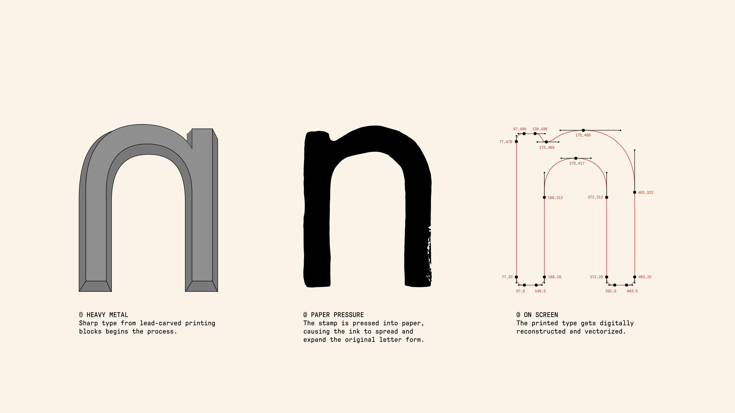
GT Pressura is drawn from the imprint of type stamped onto a surface. When the letters are pressed into the material, the ink spreads and expands beyond the edges of the sharp, carved characters. Those printed impressions informed the digitally reconstructed and vectorized form of the typeface. The resulting design feels soft yet precise.
Aa
Aa
Mn
Shape shifting
GT Pressura is constructed with strategic half-arcs and straightened elements to form the skeleton of the typeface. The quarter-circle shapes are assembled and then adjusted to allow for flexibility in the design, contrasting a monotone width and industrial horizontals with simple, unrefined shapes.
Design principle
GT Pressura’s form is inspired by the transfer of ink to paper, where stamped letters transform under the pressure of a printing press and emerge on the paper as a completely new version of the type — rounded and imperfect, an element of the design that only exists as a result of this process.
Weights & families
The rounded letters always create the same outline no matter the weight, behaving the way that letters would in analog printing. Each weight appears slightly heavier than the name suggests to reflect the results of ink under pressure.
Refreshed design
The Extended width allows for a more organic expression, expanding on the slightly condensed standard width’s rigid feeling. Light to Black weights in both upright and italic styles complete the picture.
Specimen
Metal
Printers would store thousands of these individual letters in massive wooden drawers called type cases. The capital letters were stored in the upper drawers, and the…
Born into a wealthy, cultured family of Moscow textile merchants in 1889, Popova possessed both the passion and the means to pursue a rigorous artistic education. Her early influences were remarkably diverse. She traveled extensively throughout Russia, deeply moved by the heavy lines and flat, vibrant color planes of medieval Russian icons and Renaissance frescoes. Yet she was equally drawn to the modern shifts happening in Western Europe. In the early 1910s, she studied in Paris at the Académie…
By 1916, under the influence of Kasimir Malevich, Popova abandoned figurative representation entirely. Joining Malevich’s Supremus group, she developed her iconic series: the Painterly Architectonics. While Malevich’s shapes floated in transcendent white voids, Popova brought a heavy, physical density to abstract painting. Her overlapping geometric planes did not float; they collided, locked together, and exerted visible tension on one another, like tectonic plates under extreme pressure. The 1917…
In 1921, during the famous 5x5=22 exhibition in Moscow, she and four fellow artists made a historic, shocking declaration: painting was dead. Fine art was a bourgeois luxury the new society could no longer afford. The artist’s duty was no longer to create decorative objects for gallery walls, but to become an “artist-constructor” working directly for industrial production. Scenography: In 1922, she designed the stage set for Vsevolod Meyerhold’s theater production The…
5001-8014 FRAGILE CONTENT
Beyond pure physics, shipping boxes are the foundational currency of the modern global economy. They are standardized into modular dimensions to maximize space efficiency inside ocean freight containers and delivery…
Warehouse Containers Shipping Intermodal
Warehouse Containers Shipping Intermodal
Litho
The subtle texture, the rich indentation of the paper, and the slight, beautiful imperfections of ink meeting metal. Furthermore, digital typography still uses the terminology coined by lead-alloy craftsmen. When you adjust the leading (the space between lines) or…
The true turning point of her life arrived with the Russian Revolution. Like many of her contemporaries, Popova believed that the birth of a new society required a radical transformation of art. Studio painting began to feel elite, bourgeois, and obsolete. In 1921, Popova and a group of fellow Constructivists made a dramatic public declaration: they formally rejected easel painting and dedicated…
She poured her architectural sensibilities directly into the everyday world. Popova designed bold, geometric typography for book covers, revolutionary propaganda posters, and porcelain. She collaborated with the visionary theater director Vsevolod Meyerhold, creating groundbreaking, minimalist stage sets out of bare scaffolding and moving wheels that acted as functional machines for the actors. Crucially, returning to the roots of her family’s wealth, she took a job at the First State Textile Printing Factory in Moscow. Alongside Varvara Stepanova, she designed vibrant, abstract textile patterns and highly functional, geometric clothing meant to liberate the modern worker. Popova was…
Specs
Everything else you need to know
Standard Collection
LatinCyrillicGreekVietnamese
Extended Collection
LatinCyrillicGreekVietnamese
Mono Collection
LatinCyrillicGreekVietnamese
Uppercase Basic
Lowercase Basic
Uppercase Extended
Lowercase Extended
Alternate Letters
Numerals
Symbols & Punctuation
Arrows
Cyrillic Uppercase
Cyrillic Lowercase
Cyrillic Alternates
Greek Uppercase
Greek Lowercase
Vietnamese Uppercase
Vietnamese Lowercase
13.07.2048
React
¿TE GUSTA?
Credits
Designed by Dominik Huber and Marc Kappeler (Moiré). Script extensions by Dominik Huber with Grilli Type. Consulting by Panos Haratzopoulos (Greek) and Donny Trương (Vietnamese).
Released in 2012/2017/2022.
Minisite

Specimen

OpenType Features
aalt, calt, case, ccmp, cpsp, dnom, frac, kern, liga, mark, mkmk, numr, ordn, pnum, sinf, ss01, subs, sups, tnum, zero
ss01 Alternate a
Language Support
Latin Extended
Afaan, Afar, Afrikaans, Albanian, Alsatian, Amis, Anuta, Aragonese, Aranese, Aromanian, Arrernte, Asturian, Atayal, Aymara, Azerbaijani, Basque, Belarusian, Bemba, Bikol, Bislama, Bosnian, Breton, Cape Verdean Creole, Catalan, Cebuano, Chamorro, Chavacano, Chichewa, Chickasaw, Cimbrian, Cofán, Cornish, Corsican, Creek, Croatian, Czech, Danish, Dawan, Dholuo, Drehu, Dutch, English, Estonian, Faroese, Fijian, Filipino, Finnish, French, Frisian, Friulian, Galician, Ganda, Genoese, German, Gikuyu, Gooniyandi, Greenlandic (Kalaallisut), Guadeloupean Creole, Gwich’in, Haitian Creole …
Cyrillic
Abaza, Adyghe, Aghul, Avar, Bashkir, Balkar, Belarusian, Bosnian, Bulgarian, Buryat, Chechen, Chuvash, Crimean Tatar, Dargin, Dungan, Erzya, Ingush, Kabardian, Kalmyk, Karachay, Karakalpak, Kazakh, Khinalugh, Komi, Kumyk, Kyrgyz, Lak, Lezgian, Macedonian, Moldovan, Mongolian, Moksha, Nanai, Nogai, Ossetian, Russian, Rusyn, Rutul, Serbian, Tabasaran, Tajik, Tat, Tatar, Turkmen, Tuvan, Uyghur, Ukrainian, Uzbek
Greek
Vietnamese
Design Space
Standard Collection
12 styles- Light
- 300
- Light Italic
- 300
- Text
- 350
- Text Italic
- 350
- Regular
- 400
- Regular Italic
- 400
- Medium
- 500
- Medium Italic
- 500
- Bold
- 700
- Bold Italic
- 700
- Black
- 900
- Black Italic
- 900
Extended Collection
12 styles- Light
- 300
- Light Italic
- 300
- Text
- 350
- Text Italic
- 350
- Regular
- 400
- Regular Italic
- 400
- Medium
- 500
- Medium Italic
- 500
- Bold
- 700
- Bold Italic
- 700
- Black
- 900
- Black Italic
- 900
Mono Collection
12 styles- Light
- 300
- Light Italic
- 300
- Text
- 350
- Text Italic
- 350
- Regular
- 400
- Regular Italic
- 400
- Medium
- 500
- Medium Italic
- 500
- Bold
- 700
- Bold Italic
- 700
- Black
- 900
- Black Italic
- 900