Everything you need to know about using variable font files in your designs.
- February 1, 2026
What are Variable Fonts?
Variable fonts are a new technology expanding on the age-old concept of static fonts. Let’s start at the beginning: one static font covers what’s called an instance; one single style of a typeface, say GT Flexa Expanded Medium. Variable fonts, on the other hand, cover a design space. This design space can cover two or more instances; for example, every design possibility from GT Flexa Compressed Lazer to GT Flexa Expanded Black.
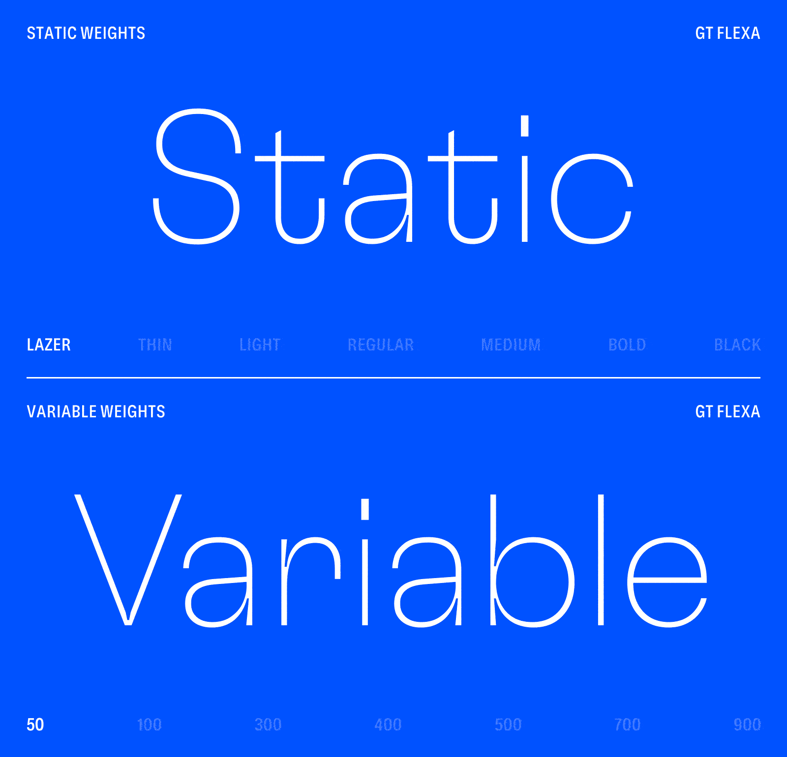
This design space is organized along axes. Axes can be a certain aspect of a typeface, like weight, width, optical size, or slant—but also abstract concepts like expressiveness. Most typefaces contain one to three axes.
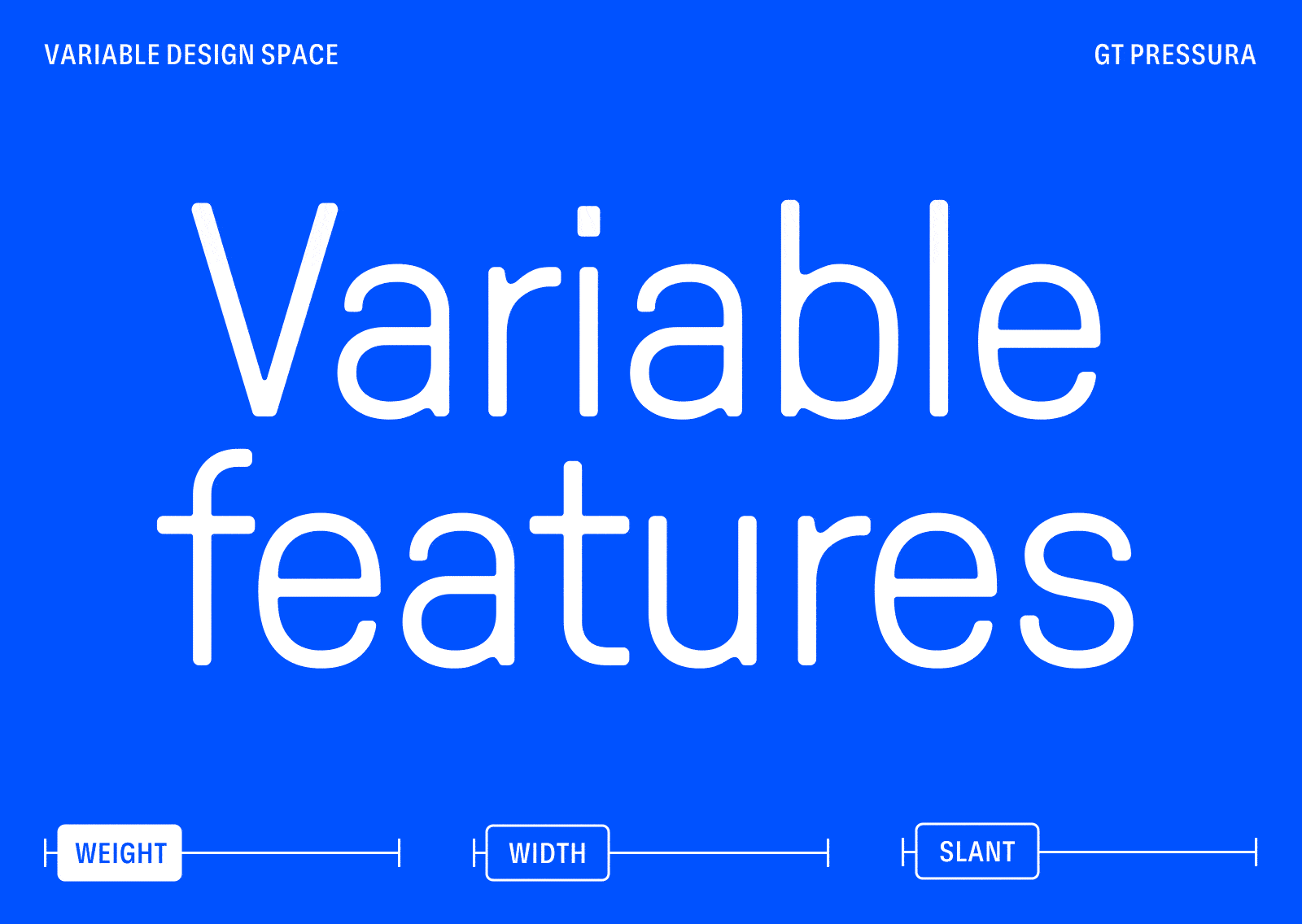
Let’s look at some of the biggest benefits of variable fonts and how you can best use them:
→ Pick the exact weight, width, and optical size of a font.
Take full control of your designs! Working on a design where the Regular is a little too light and the Medium a bit too bold? That’s a problem for past you. Future you just adds a few units on the weight axis and drives off into the sunset. For families that also support width or optical size axes, this can get even more granular. Mobile layouts could use a slightly narrower version of GT America, for example. And with optical sizes, you can fully adjust the user experience by ensuring legibility and brand impact across the font size spectrum.
→ No more “the fonts are too heavy” complaints from your developers.
With rich web typography, font file sizes can quickly become a point of contention. Designers want to use Condensed for meta info, multiple Standard-width weights for the main content, and a Display style for the biggest headlines. This can lead to hundreds of kilobytes of font files, and more importantly, many file requests from the server. With variable fonts, this entire design space can be accessed from a single web font file. The break-even point for file size is usually around 3-5 font styles, and the fewer server requests, the better.
→ Accessibility.
Finely-tuned typography means typography optimized for accessibility; unlike more standardized parts of accessibility work, typography can be fuzzy in this regard. But one thing is clear: appropriate typographic choices lead to better legibility, which in turn means better accessibility. For typeface families with optical sizes, this is even easier to achieve: you can either let the browser match the font size with the optical size setting automatically, or you can set them manually. In both cases, your users get the same typeface design language adjusted appropriately for the font sizes you use.
→ Flex those animation muscles.
Animating type can help you communicate better, no matter if you’re creating a marketing video or designing a user interface for web, desktop, or mobile. Button hovers suddenly feel smooth and contemporarily digital instead of choppy and old-fashioned. And of course, our typefaces can flex in many directions: weight, width, slant angle… and more.
→ Turn it to eleven.
Typefaces with optical size axes allow for functionality in small sizes and expression in larger sizes, all within the same design space. This is often useful for digital products, when you want punchy headlines and great user interface performance all within the same typeface family. But you might find use for optical sizes in many other situations. Optical sizes feature different contrast between thick and thin strokes, wider spacing for better text-size performance, and many other such adjustments.
Axes
Each variable font has one or more axes. The combination of choices from these axes results in a specific design output. Sounds complicated? Let’s break it down!
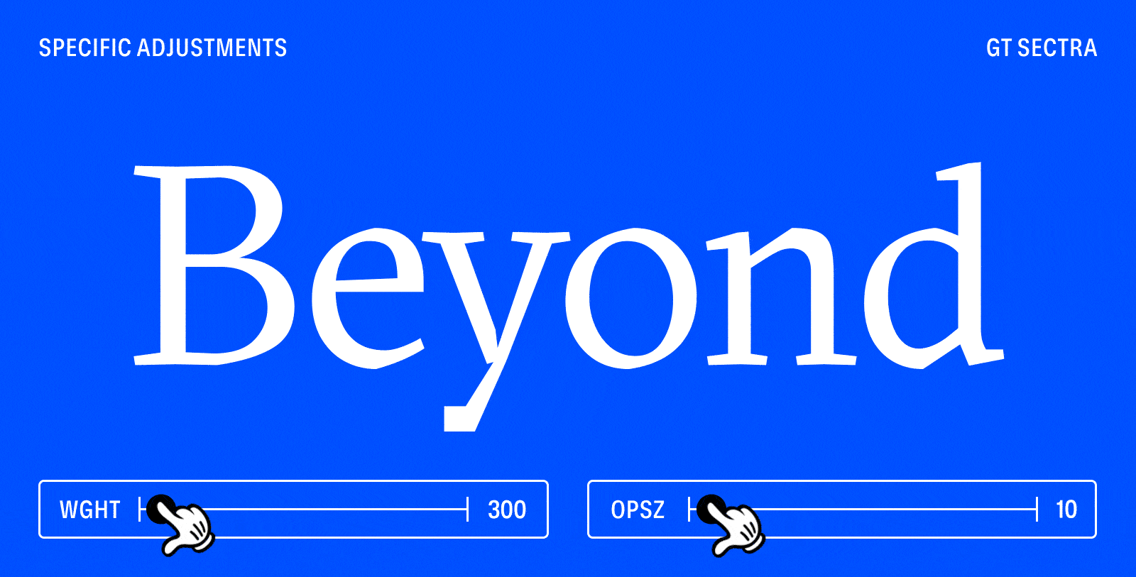
Using GT Sectra Upright means you get to choose your design along two axes: weight (wght) and optical size (opsz). Let’s say you’re looking for something a little heavier than Bold, and optimized for font sizes of around 30px. So you might choose the axes values wght 750 and opsz 30.
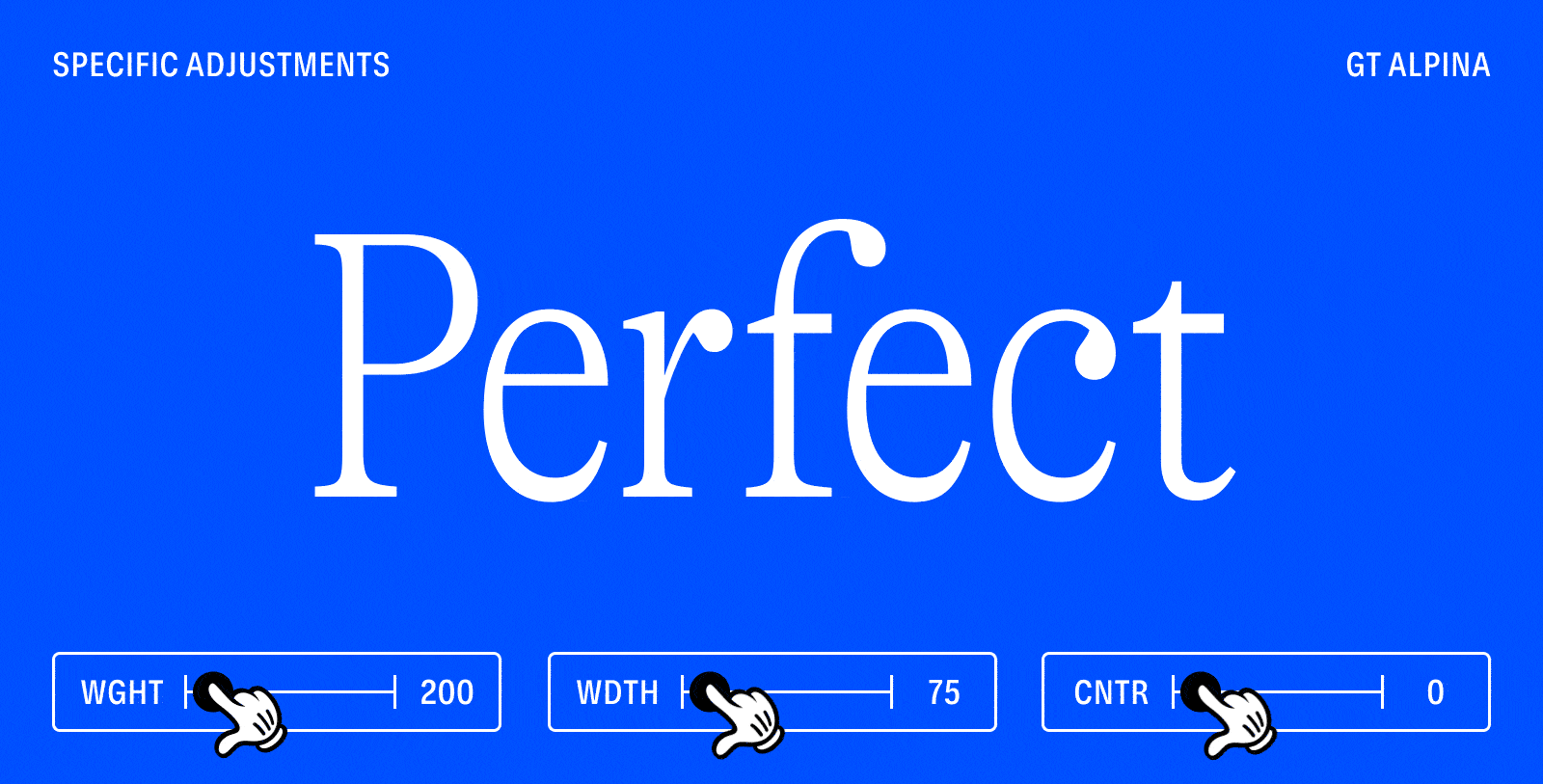
Visualizing the design spaces of typefaces with more than two axes can quickly get hairy, so we’ll spare you the 3D (or 4D! 5D!) visualizations. But picking your font styles still follows exactly the same pattern. It’s easiest to start with a pre-defined instance and adjust those axes values as necessary for your design.
You may wonder what axes we have in store for you. Here’s a list of the official, registered axes (as defined in the OpenType® Specification Version 1.9). You can read this really exciting font format specification, but there aren’t any animations in that one. Ours is more fun. See below:
Weight
Axis tag name: wght
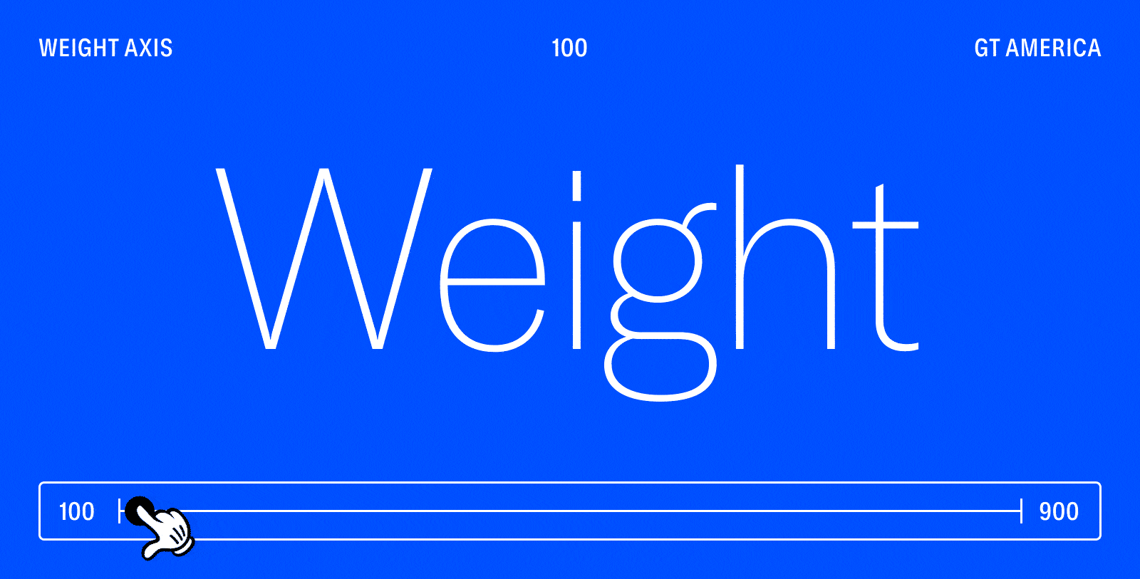
The weight axis depends on the number of weights defined as instances, as well as the overall breadth of the typeface’s weight range. For example, GT America runs from 100 to 900. No matter the weight range, if available, 400 is Regular and 700 is Bold.
Width
Axis tag name: wdth
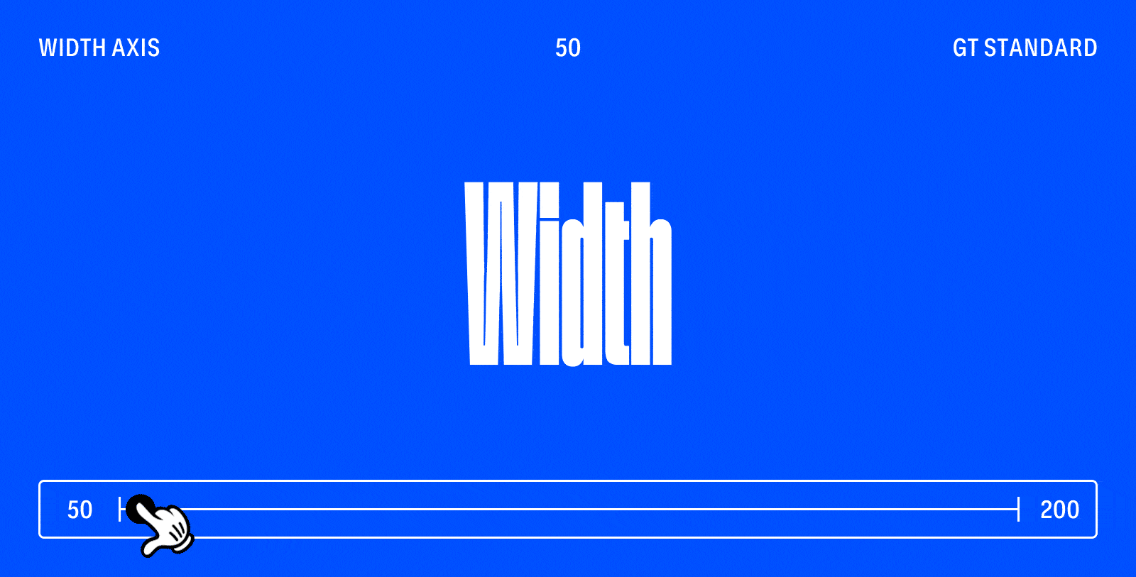
The width axis’ labeling can vary widely from foundry to foundry, but 100 should always be the default width or center point of the family. At Grilli Type, we call that part of the family the Standard width.
Optical Size
Axis tag name: opsz
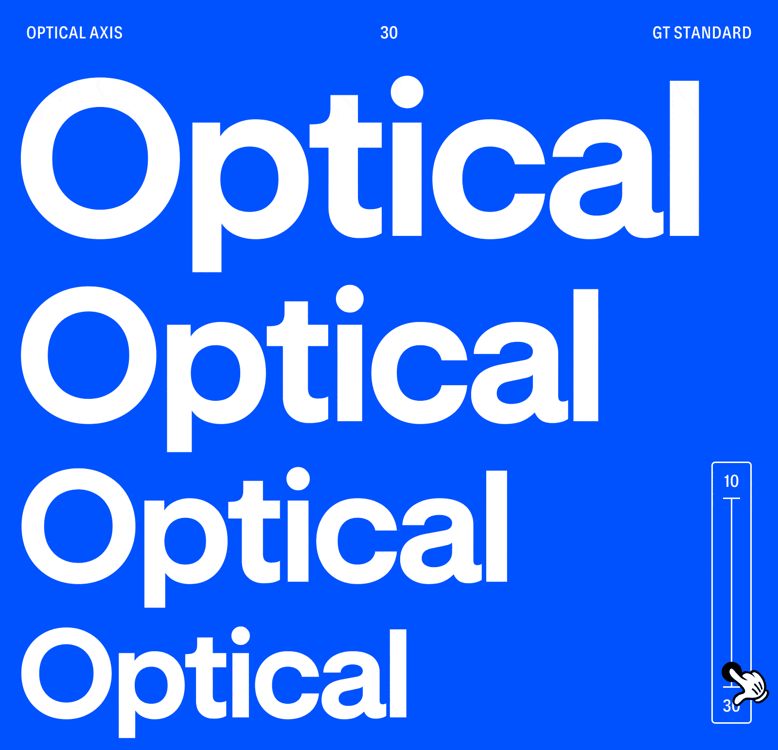
Optical size is an age-old principle that fell to the wayside with early digital fonts, but is finally making a comeback. It boils down to the fact that a typeface expresses its design ideas differently at different font sizes. In small sizes you want less fine details and wider spacing. For large sizes you want visual impact and can show off intricate details, especially in serif typefaces. Optical sizing can either be done automatically or you can choose it manually. Optical size axis’ values should be identical to the pixel sizes for which the typeface is optimized. (I.e. an opsz size value of 16 means that this is the exact style of the typeface that should probably be shown at 16px size.)
Slant/Italic
Axis tag name: slnt/ital
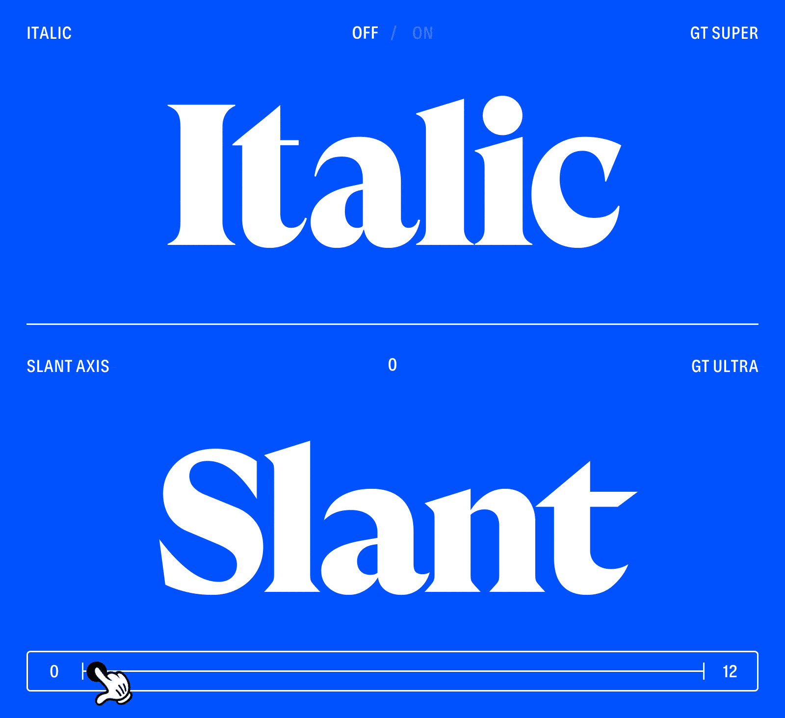
Slant and Italic axes are easy to confuse, but knowing which one is available will help you make a more informed typeface choice. Both axes’ extremes mean a typeface style that has some kind of slant angle compared to the Upright or Roman styles. However, it is not only the angle that is decisive. Whether a font has an italic or slant axis depends on the following:
The Slant axis is most-often used for sans serif typefaces that have so-called Oblique designs for their Italics, but it can also cover true Italics as long as their node structure (how the letters are constructed in vector format) is compatible to their Upright cousins. The Slant axis’ range covers the entire Slant angle spectrum, for example 0 to 12 for GT Ultra and -45° to +45° for GT Planar (yes! GT Planar features an insane 90° angle of slant options!).
The Italic axis is most-often used if the Upright and Italic designs use alternate shapes, meaning that the two designs differ in how they are constructed as vector graphics. In most applications, there is no gradual change from Upright to Italic. The Italic axis is either on (1) or off (0), causing the shapes to jump from Upright to Italic forms instead of smoothly interpolating between the two.
At Grilli Type, we prefer keeping the Upright and Italic designs in separate variable fonts to ensure the smallest-possible file size. Mixing a world of interpolation with one where the design suddenly jumps from A to B can be confusing. Nonetheless, the Italic axis would enable such variable fonts to contain the entire design space within a single font file, and some foundries do it that way.
The axes listed above are the official axes, but variable fonts can contain any kind of axes defined by the typeface’s designer! Below are some that we found necessary to express design ideas in our library:
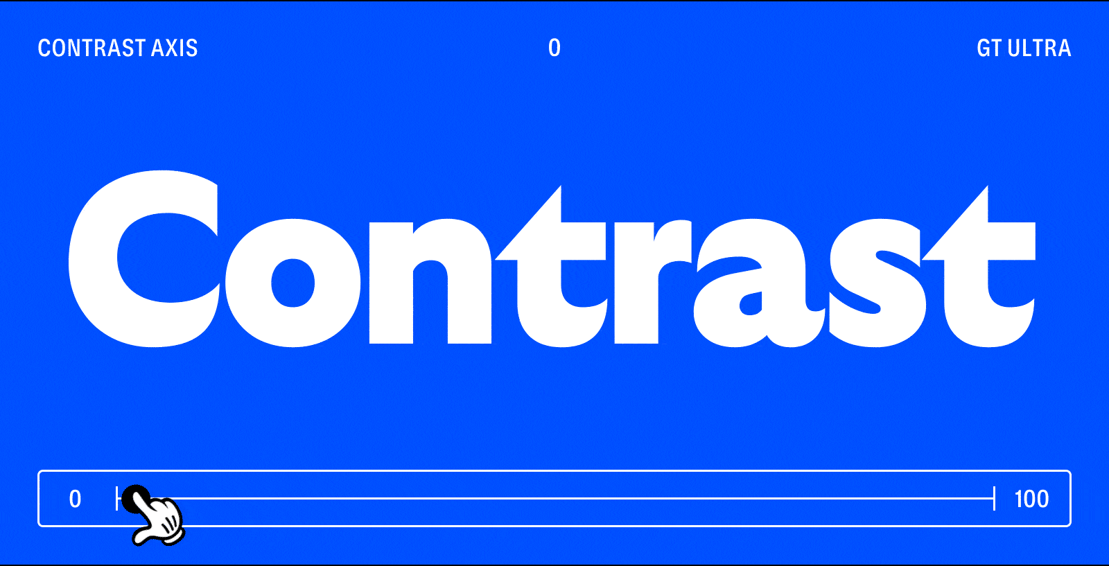
Contrast Axis
Axis tag name: CNTR
In addition to its Weight and Slant axes, GT Ultra offers a Contrast axis. Living between the worlds of sans and serif typefaces, this axis affords control not just over the stroke contrast—how much difference there is between thick and thin parts of the letters—but also adds serifs to stroke terminals.
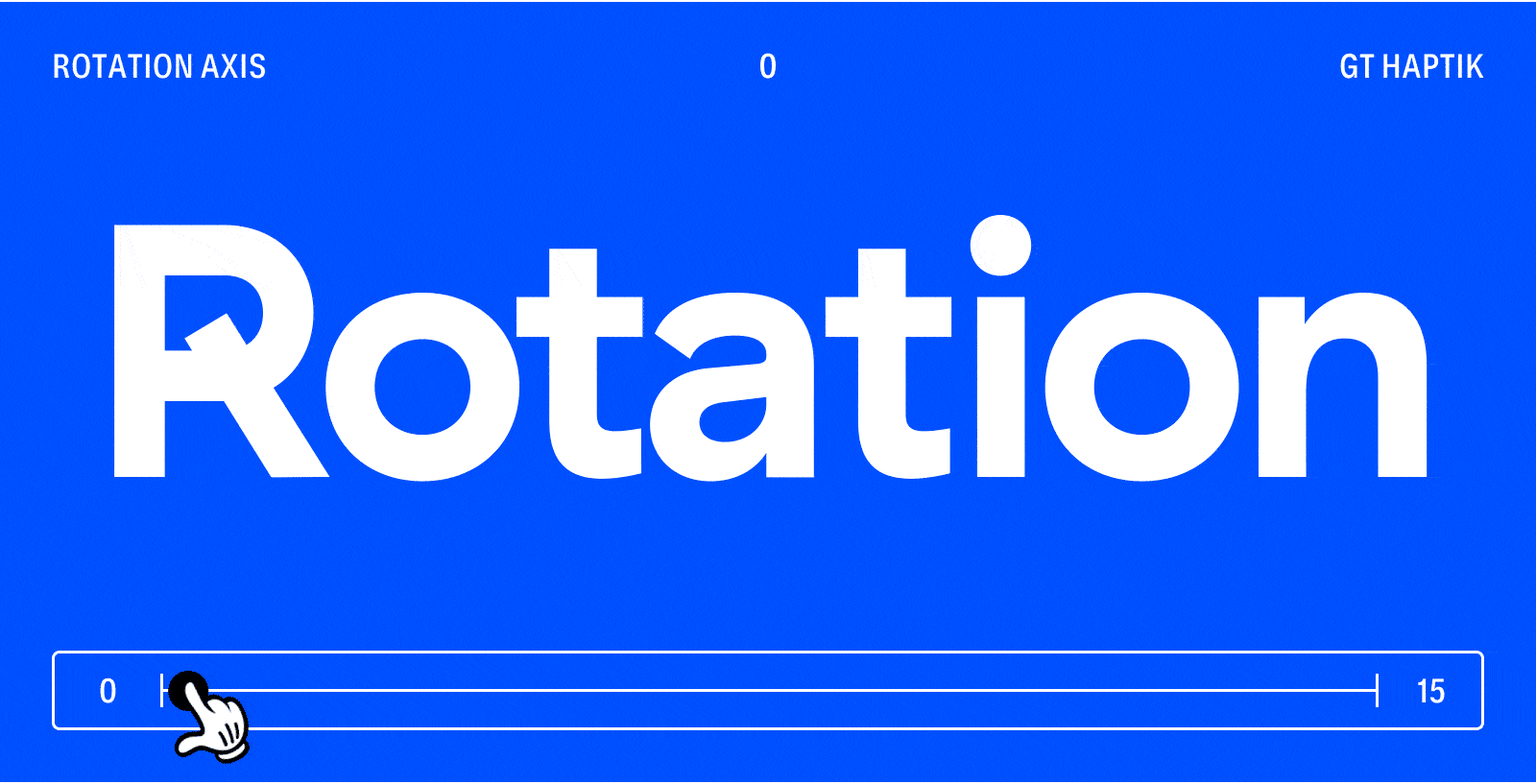
Rotation Axis
Axis tag name: ROTA
When a slant axis just isn’t enough, GT Haptik features a Rotation axis in addition to its Weight and Slant axes. This allows you to rotate the entire character by up to 15°, enabling fun surprises especially when initiated by user action.
Using Variable Fonts
Now that you know all the theory there is to know about VFs, how do you actually put them to practical use? It’s very easy: you install them and then you use them in your favorite design apps! Both Windows and Mac support the font format natively. Likewise, as a developer you can use them on the web and in your desktop and mobile apps.
Variable fonts come in two font file types: TTF and WOFF2. You should use TTF for desktop use only (when you’re designing) and WOFF2 for everything else.
The great thing about variable fonts is that the foundry can still define instances. And as you know, instances are the same as the static font styles from the old days (back when we were… *checks calendar* 7 years younger). So go ahead and install the variable fonts from our free trial fonts package and test your heart out. You’ll see that the styles are still listed to be selected, but in addition your design app will show (one way or another) a list of the axes as sliders to adjust.
VF at Grilli Type

Not every type foundry is treating this new font format the same way. At Grilli Type, we’re excited about variable fonts and are actively supporting the adoption across the design industry. For example, we helped design tool-maker Figma with beta testing their variable fonts support to ensure all of your favorite (ahem: Grilli Type) fonts work flawlessly, and that the user interface is easy to use.
We are currently working on converting our entire library to be available as variable fonts, but many of our typeface families are already available as variable fonts, including GT Pressura, GT Planar, GT Ultra, GT Maru, GT Flexa, and GT Alpina. When you buy a Full Family license, you can email us after your purchase and we’ll send you the variable font file(s) right away. Additionally, please email us if you’re interested in receiving one of our other families in variable font formats—we might already have finished the conversion!
We’re also revamping our shop to implement variable fonts natively and make buying licensing for variable fonts as easy as it is for static fonts. Stay tuned!
More Resources
- V Fonts, a website collecting variable fonts from different type designers
- Wakamai Fondue, a type testing website
- Variable fonts Playground: Axis Praxis, a space to test OpenType variable fonts
- Dinamo Font Gauntlet, a website to test your variable fonts
- 3D Axis Visualizer, lets you look at all the angles of the design space
- Check what’s inside a variable font with FontDrop online
- Check what’s inside a variable font with the Font Goggles app on your Mac
- Your Typeface, lets you use your facial expressions to manipulate the type
- Typearture, shows VF possibilities with variable color font initials
- WOAH Typeface Family, Future Fonts type tester
- V Fonts, a list of variable fonts with unusual variation axes
Look out for parts 2 and 3 of this guide for more about how to use variable fonts in each major design application, as well as on the web.
