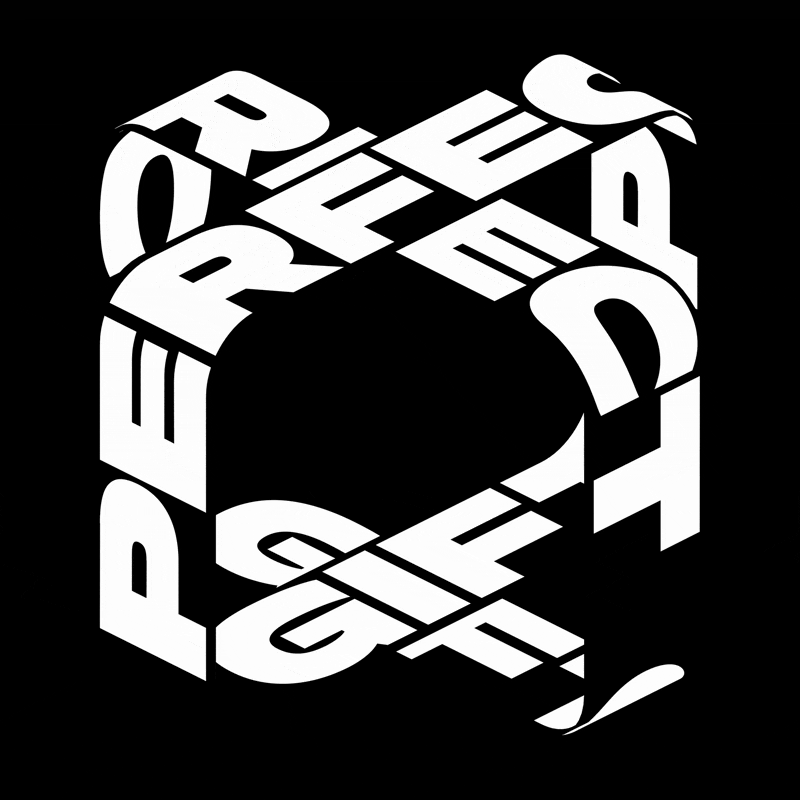
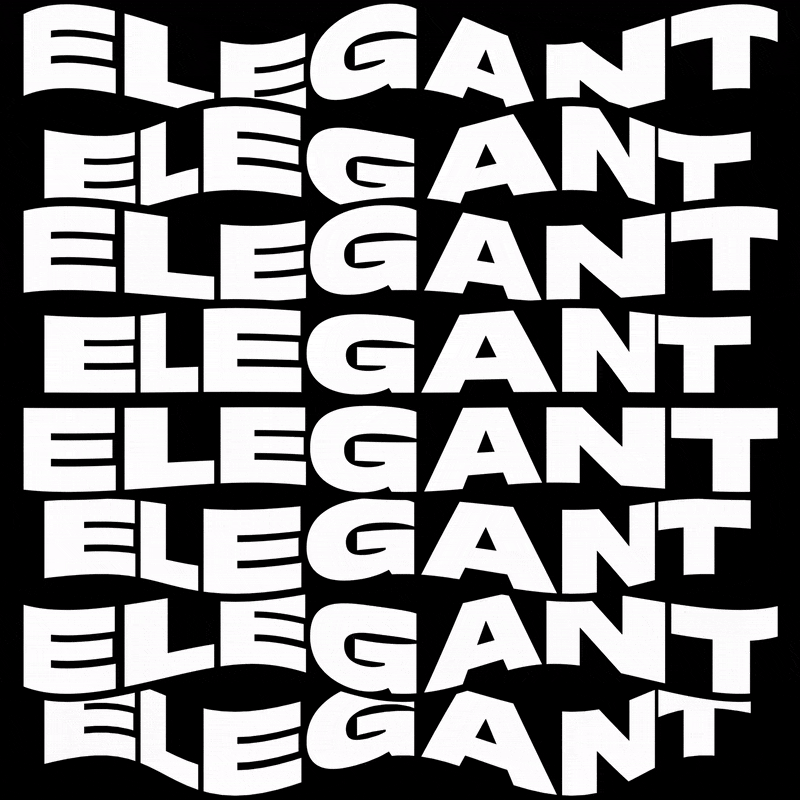
We were asked by Wunderman Thompson Belgium to create a custom typeface for Samsonite to accompany their global Born To Go campaign. The typeface is being used for Samsonite’s packaging, website, as well as in all of their advertisements.
- Custom Typeface2019
- BrandingWunderman Thompson Belgium
- Custom typefaceGrilli Type
- Type AnimationsAnthony Velen & Kenny Brandenberger
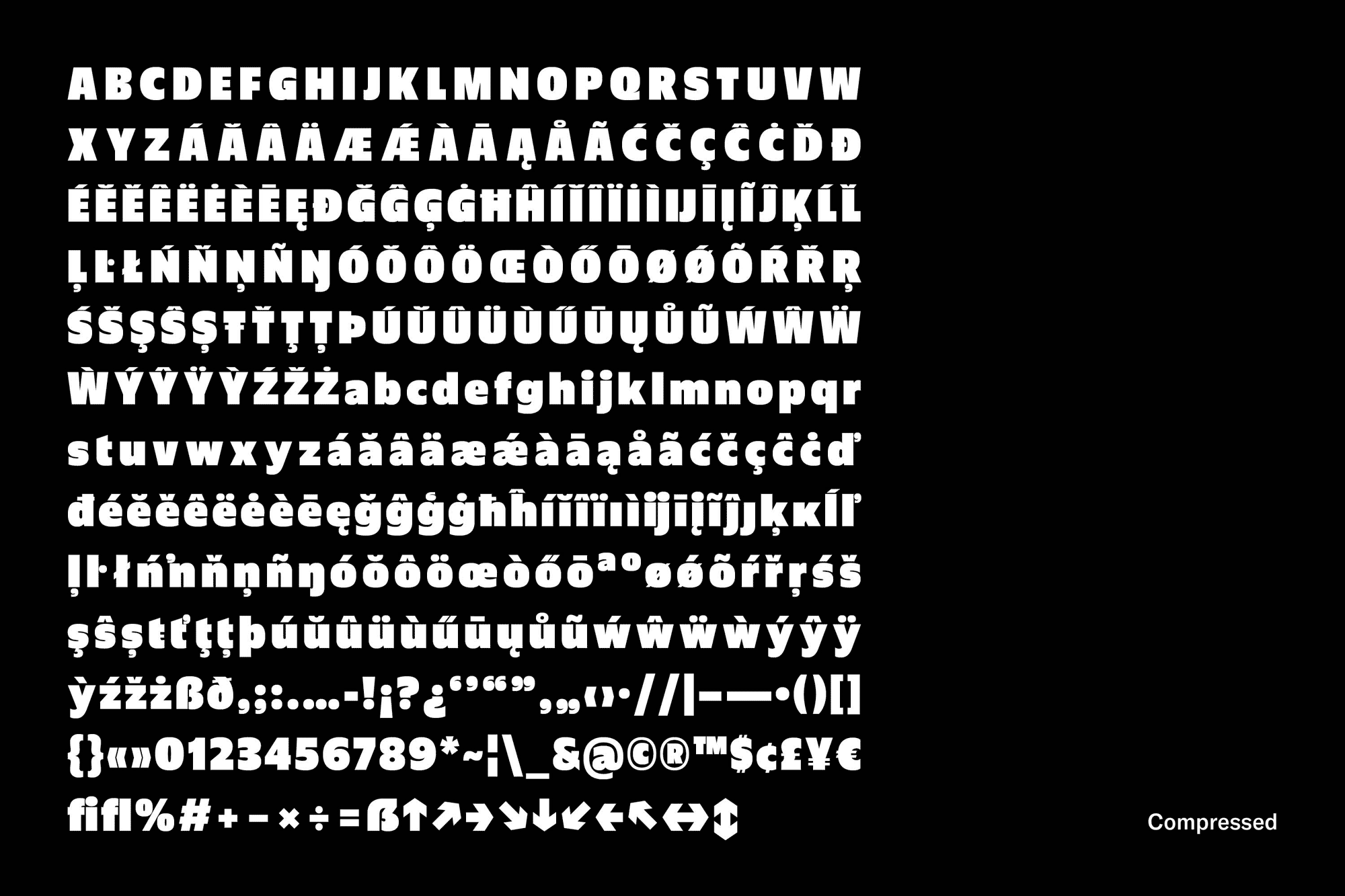
We designed a typeface family consisting of one weight in five widths. This family structure is reflective of Samsonite’s highlighting of how the brand’s products are a great fit for a life on the go — whether that’s for travel or on your everyday commute — and can thus adjust to your needs.

Samsonite Sans is rooted in the penmanship of the renaissance period. But Samsonite is a brand looking forward: as such, our take on the genre reacts to the question of how this design language can be brought into the 21st century, with humanity meeting technology at an ever-faster pace.
The adaptability of letters being animated played an important part in the design of the typeface. The videos are a key element for the global campaign that emphasizes a life in motion, showing up online and around the world. The animations were created by Anthony Velen and Kenny Brandenberger.