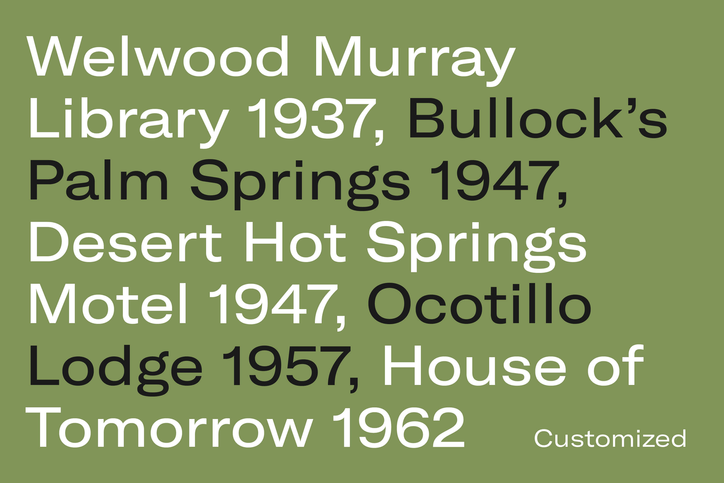
Placeholder NYC approached us to design a customized version of GT America for their client Burrow. Burrow is a furniture start-up with a focus on functional collections referencing mid-century design.
- Customized Typeface2018
- BrandingPlaceholder NYC
- Customized typefaceGT America by Noël Leu
The new typeface is based on our GT America Extended Regular. The customized version aims to be functional yet warm. But like mid-century furniture design, it is never decorative for decoration’s sake.
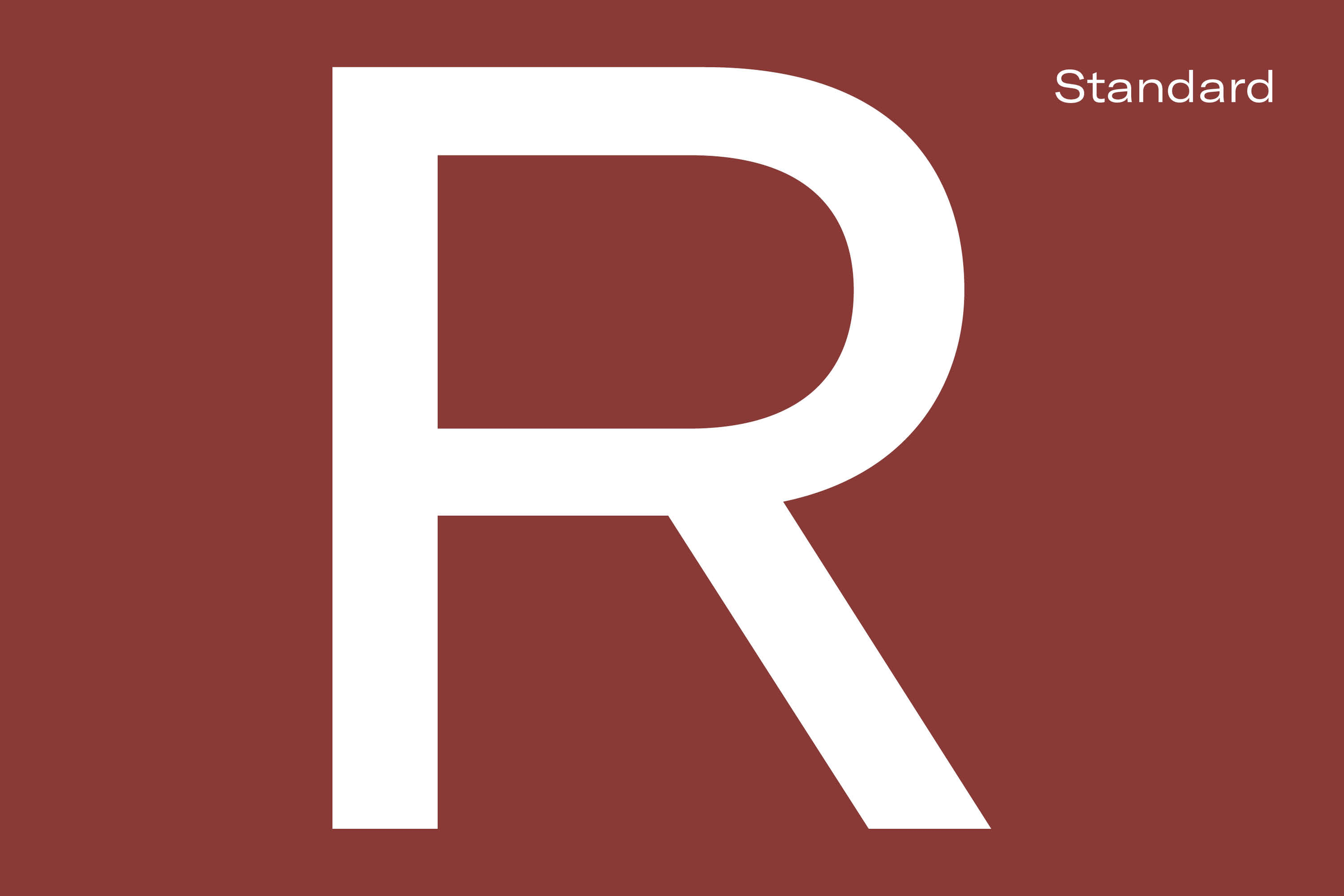
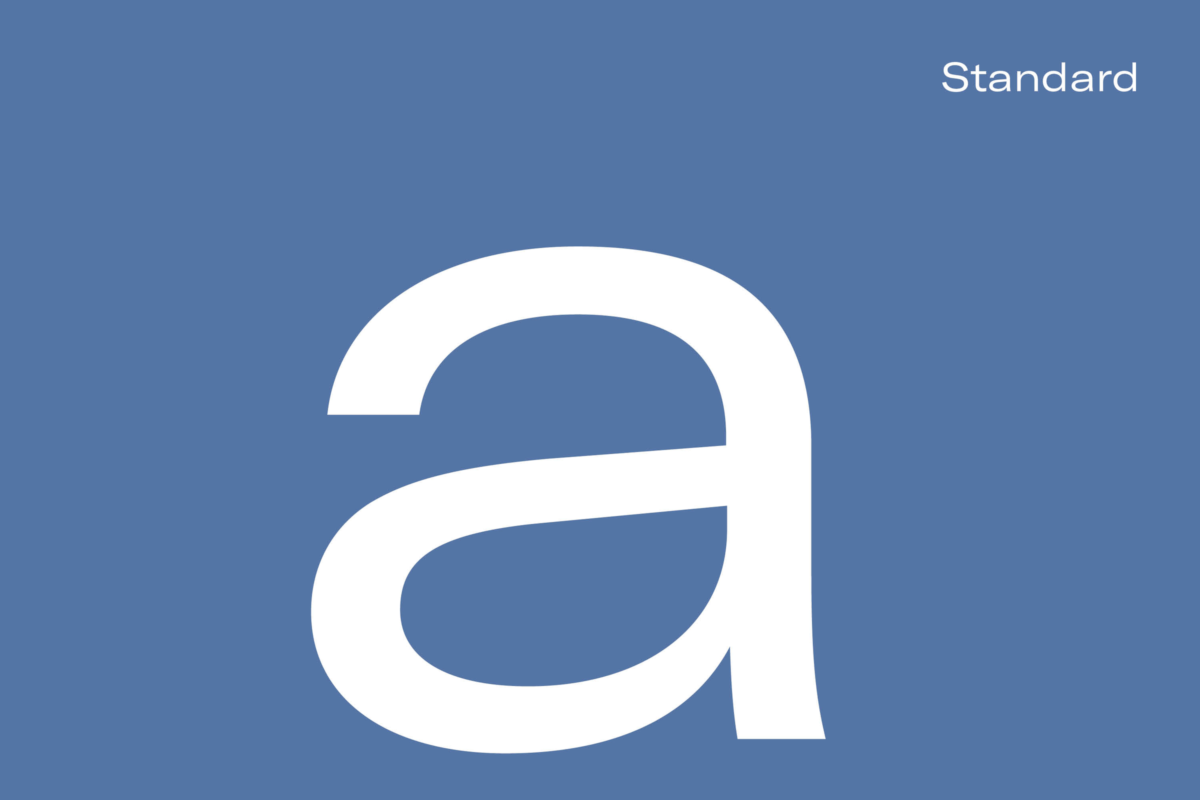
Burrow’s font sports horizontal stroke endings and a more regular rhythm. This is achieved by normalizing the widths of characters. The whole typeface is also a little bolder. We specifically reworked the letters a, Q, and R completely to mirror Burrow’s unique approach to furniture-making: innovative when necessary but also staying true to time-tested shapes and ideas when useful.