Working with Wieden + Kennedy London, we created a custom typeface system for Marshalls’ new visual identity.
- Custom Typeface2020
- BrandingWieden + Kennedy London
- ImagesGrilli Type and Marshalls
- AnimationsGrilli Type
- Custom TypefaceGrilli Type
Designer Type: Marshalls’ Edition
In 2020, Wieden + Kennedy London’s creative team took on a brand refresh for Marshalls, one of the largest off-price retailers in the U.S. W+K reached out to us for a custom typeface to complement the retailer’s new visual identity with Sans and Serif type families across online and in-store materials.
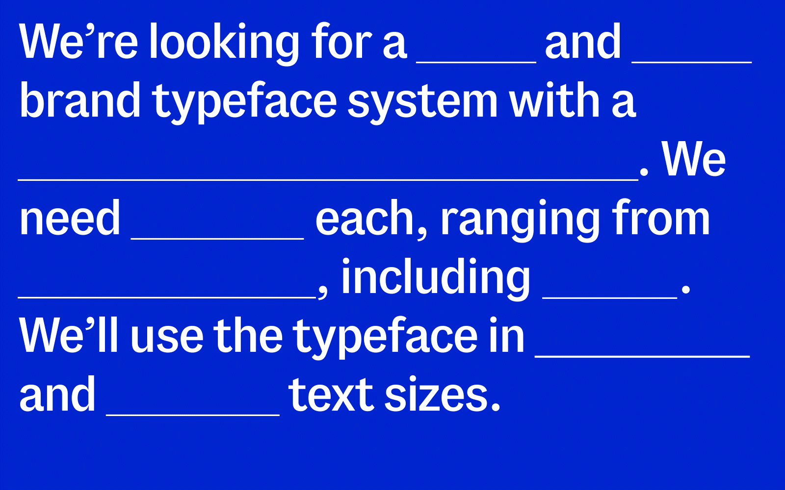
We have a secret-sauce approach to custom projects like these—we like to do this ad-lib style, prompting the client to fill-in-the-blanks for what their goals are with a custom typeface.
We work with clients to build a solid foundation for the project by asking for visual briefings and strategy papers. Strategy papers give us access to the verbal world of how a brand is shaped. Even words that might sound generic—like “dynamic” or “customer-centric” help us translate the characteristics of a brand into design details for the typeface.
Verbal to Visual
Wieden + Kennedy London really laid the groundwork for us by gathering all the verbal elements of the company’s new visual world. W+K was in the process of redesigning Marshalls’ complete visual identity, and needed a custom typeface. By the time we came in, we had a clear starting point with the brand DNA gathered by W+K to get going.
W+K’s brand DNA document collected all of the components necessary for us to build a new typeface that helps reflect the brand’s personality. While a typeface may only be one part of a company’s visual identity, it’s crucial to fine-tuning the brand’s character. Thanks to Marshalls’ robust brand vocabulary, creating a concise briefing for the custom typefaces was effortless and helped us map our design space. We chose a range from “aspirational” to “joyful” to work within when choosing the typeface’s characteristics.
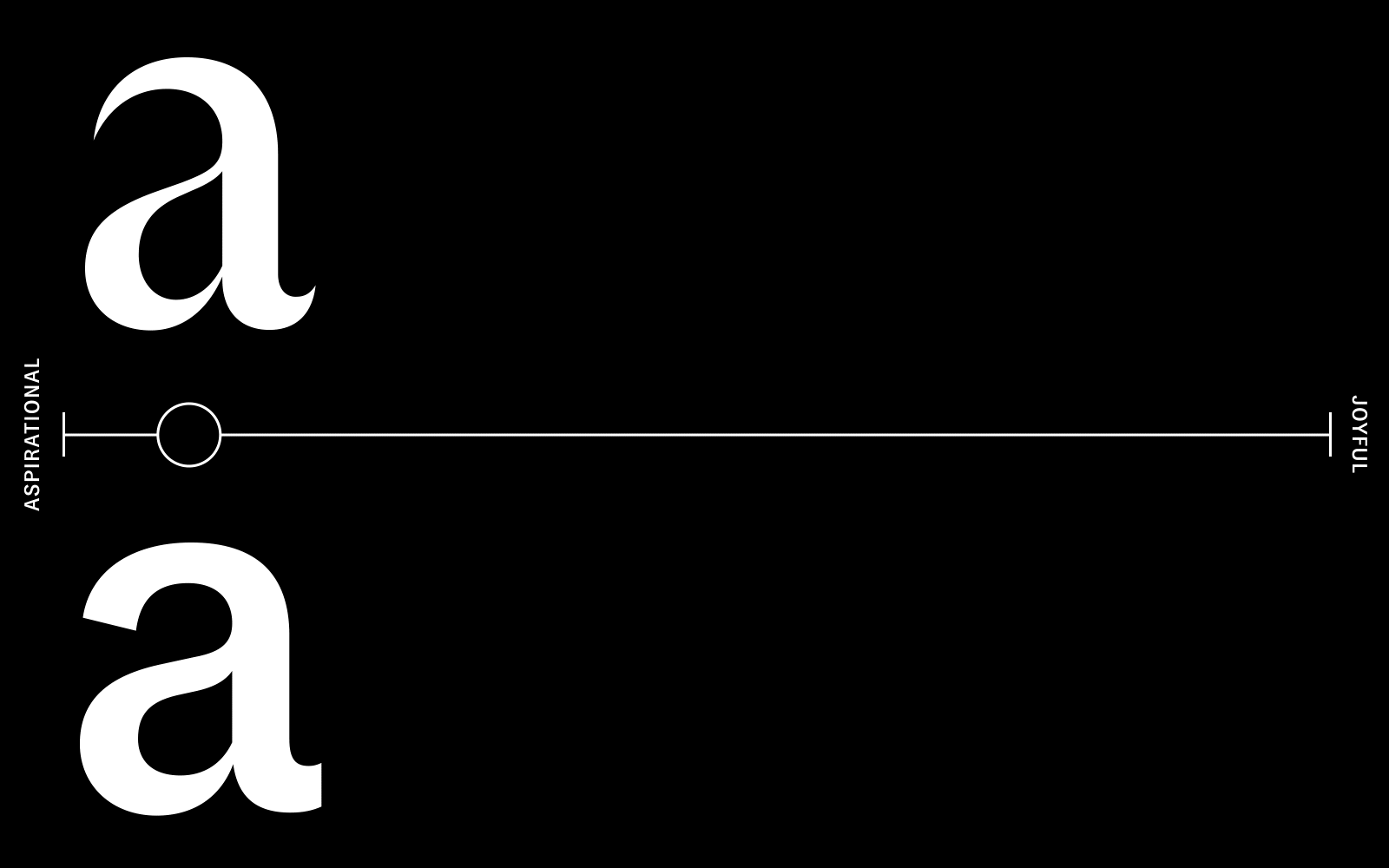
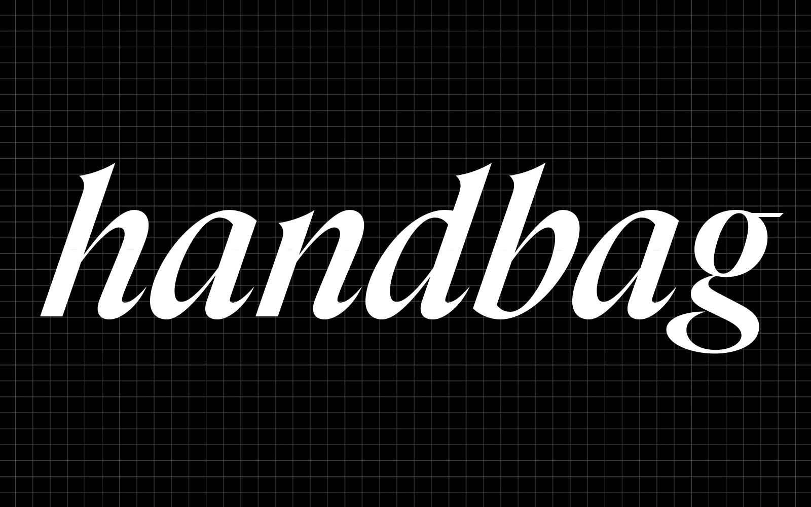
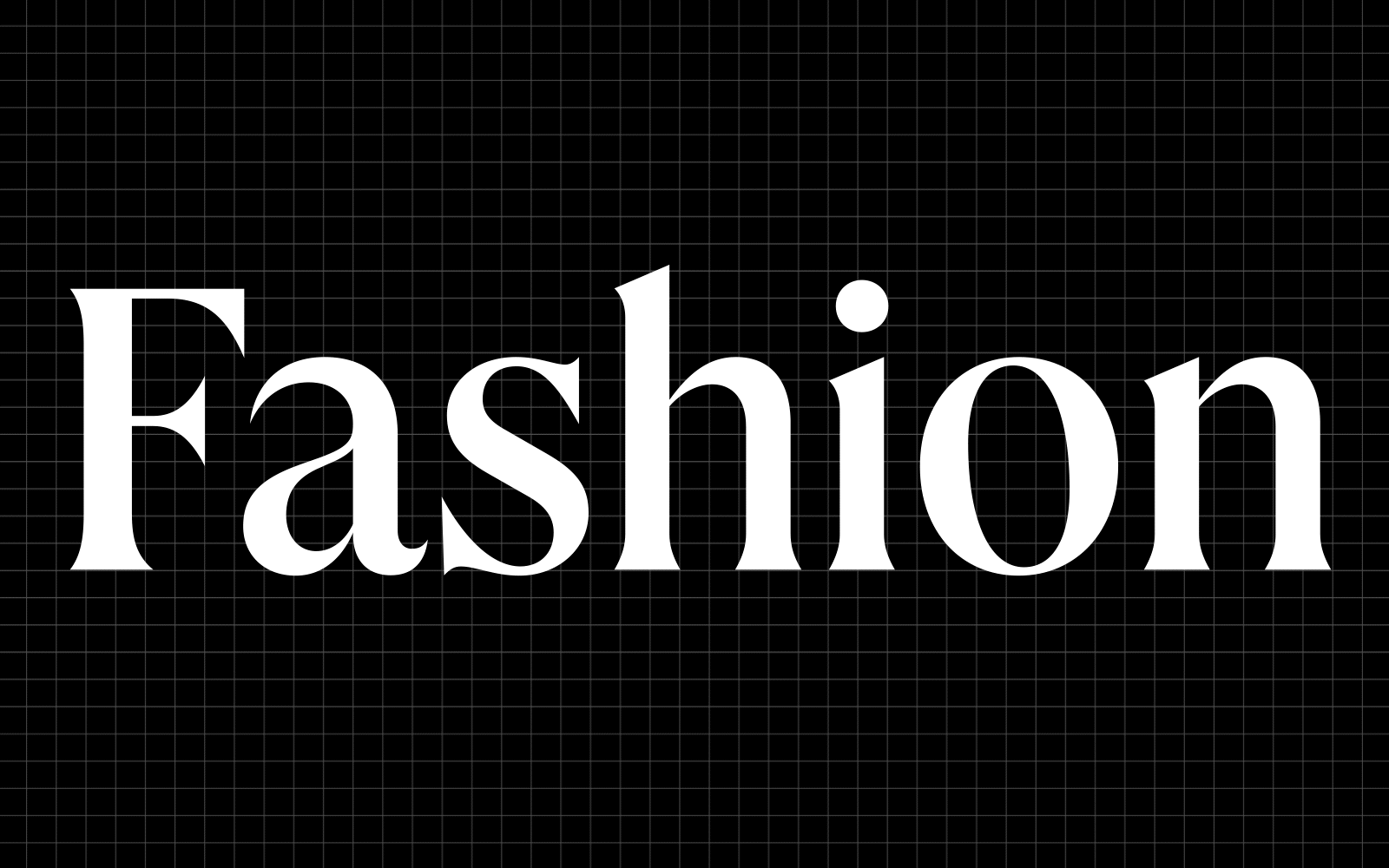
Marshalls needed a Sans and Serif pair for their new look. The briefing called for a Sans that’s not too regularized—one that echoes the inherent quirkiness of early 20th century grotesques and an elegant, confident Serif with some calligraphic traits and plenty of character. Last but not least, the type system needed to work across all weights, from Light to Black.
We pulled some Serif and Grotesque specimen for visual inspiration in line with the more aspirational style they envisioned for the type. Both type styles needed to be able to work together and separately for Marshalls, whose branding relies heavily on quick-turnaround, digital campaigns.


Design Details
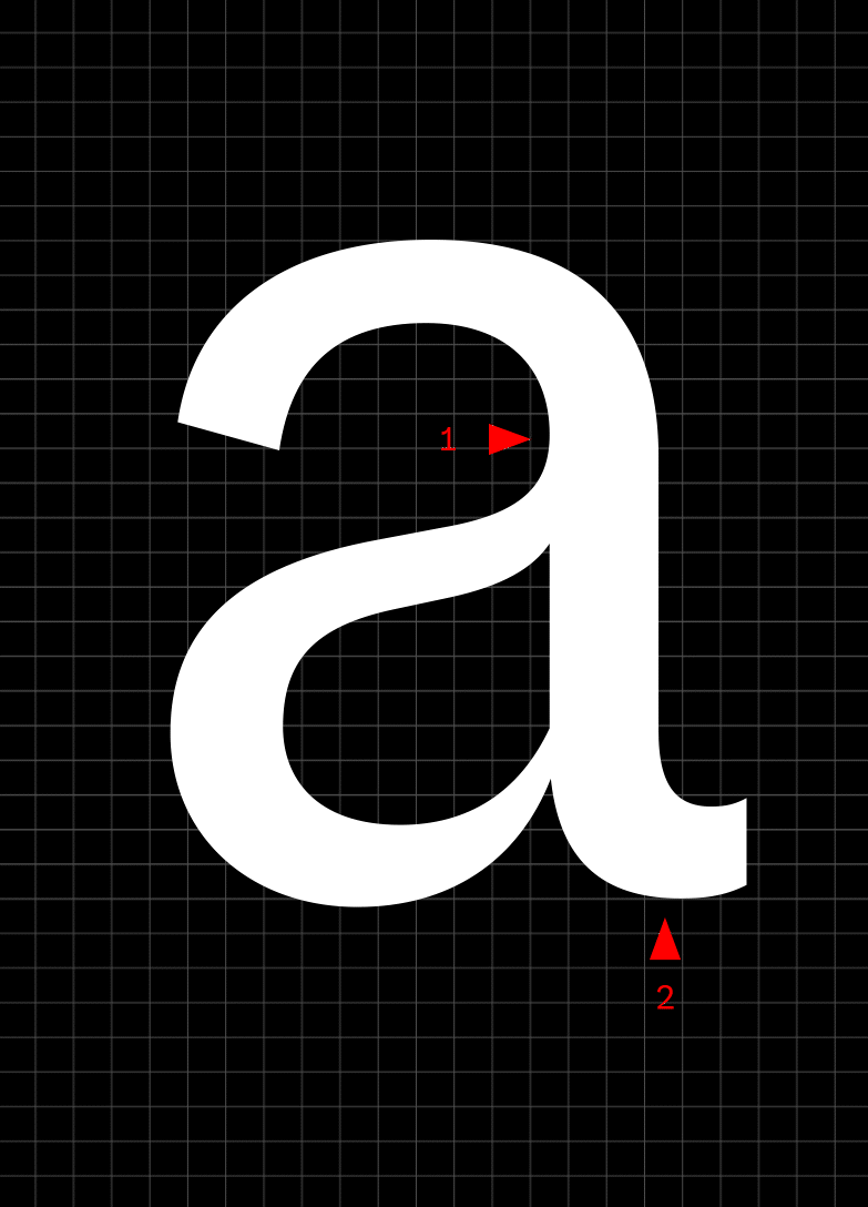
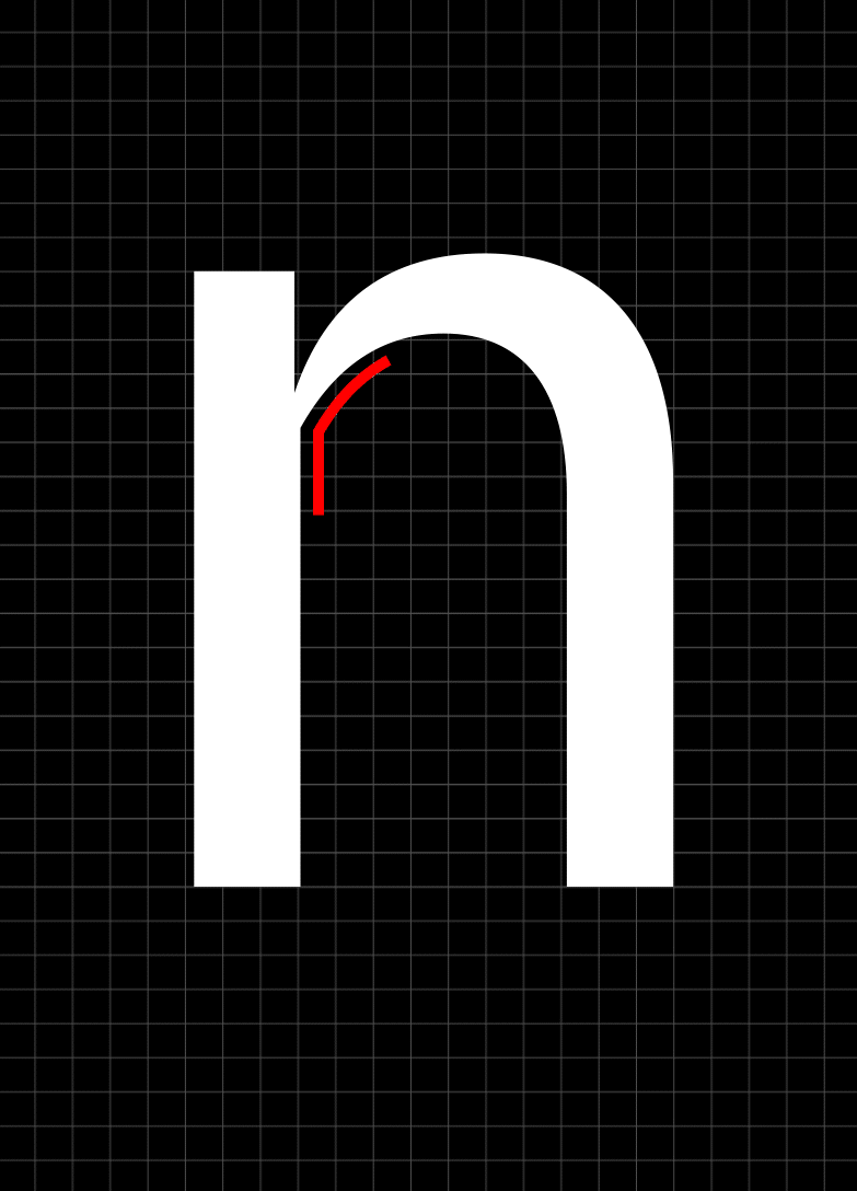
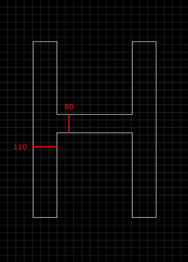
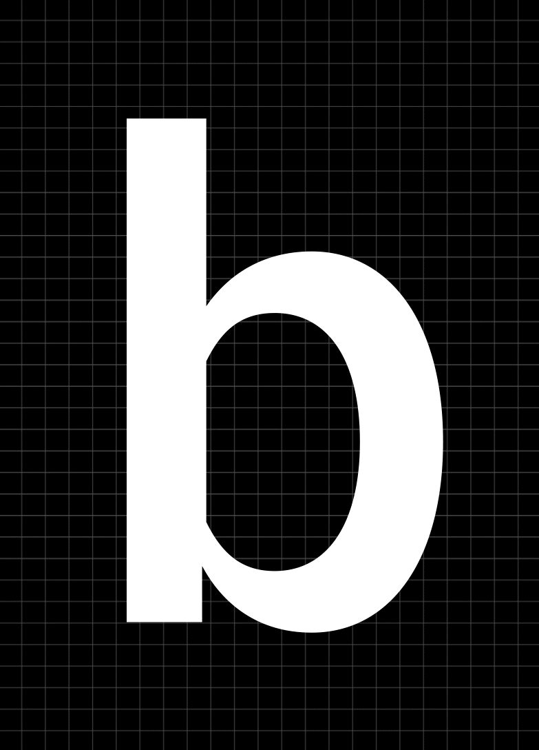
The Sans and Serif typefaces share similarities in construction, like tapering at the joints, and an interrupted connection of bowl to stem. The lowercase A shares the same construction, with matching characteristics visible within the curve that leads into the bowl of the A, and the tail. A higher contrast gives the typeface a confident and elegant appearance. The typeface might seem more serious, but it also appears more energetic.
Marshalls, Revamped
With the help of W+K’s creative energy and using the strategy papers to their full potential, we were able to create a typeface just as glamorous as their fresh new look.