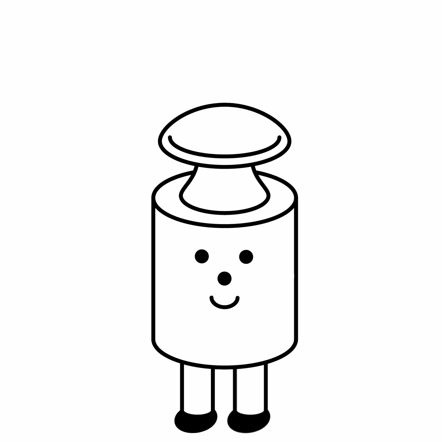
Parisian brand le gramme, known for their sleek industrial-inspired jewelry, reached out to us for a custom version of GT America and a very cute mascot.
- Typeface Customization2025
- GT America customizationGrilli Type
- Images and Animationsle gramme and Grilli Type
At Grilli Type, we’re not big fans of artificial boundaries between creative disciplines. Instead, we prefer to do a lot of things – embodying a transdisciplinary practice, one where type design, graphic design, and illustration intermingle. Tackling projects, objects, and outcomes on the basis of creativity, not discipline. So, you can imagine how happy we were when Parisian jewellery brand le gramme reached out not simply for typographic trickery but for mascot making…

Renowned for their beautiful, minimalist jewellery, le gramme uniquely operates under a weight-based system for selling their wares, approaching their business with a distinctive, no-bullshit philosophy. As such, le gramme had already opted for GT America as their workhorse brand typeface; however, they felt the need for a unifying mascot. One that was not only simple in the concept, form, and function of its character but one that further expanded on the idea of less is more. An exercise in creating character from simple shapes. Silliness and functionality in one. Grilli Type’s own brand of modernism.
In the development of le gramme’s mascot we explored a number of concepts, each with its unique flair and complexity. However, we soon realised that the most simple solution fit the brand – something so obvious that it couldn’t be topped. So, we opted for the most tried and tested approach to mascot design seen the world over: get a relevant object and put sneakers and a face on it. And since le gramme bases their jewellery off material weight, there was only one way to go… by taking ‘The Gram’ as a character (who quickly garnered the name Newton), we swiftly found how much expression simple forms could project. Using only basic shapes, Newton came to life as a proud, playful figure whose design and actions not only embody what le gramme offers but guides an audience across the brand. Not to mention that, as the personification of a gram, Newton characterises the creation of the French-invented metric system – something le gramme were very happy to celebrate.

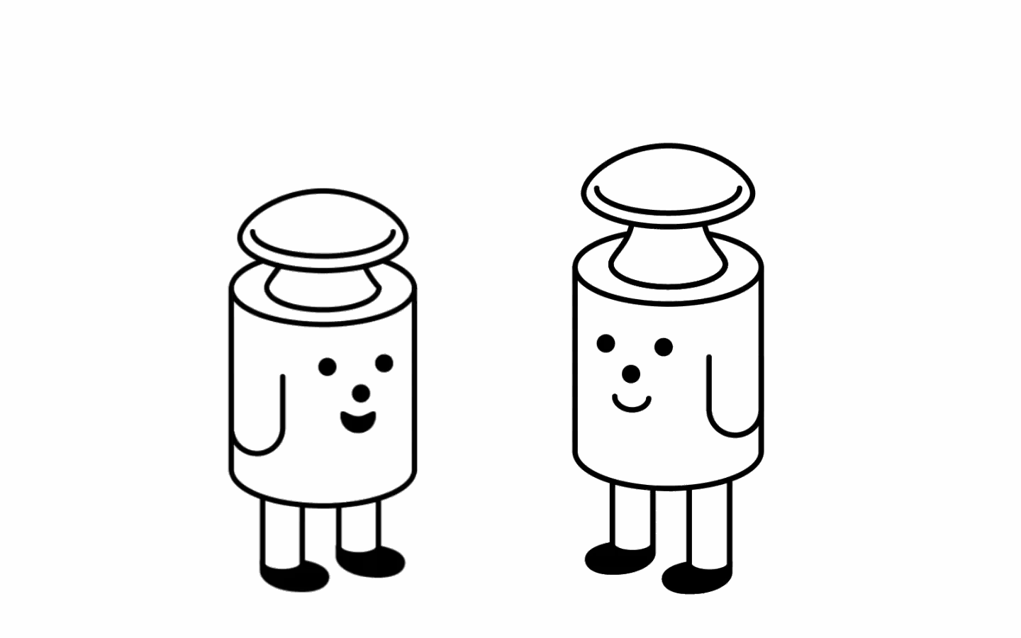
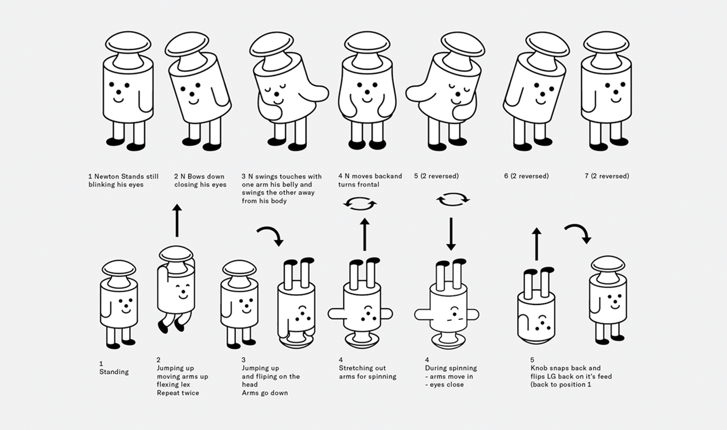
Newton truly came to life in motion, where we explored possibilities, personalities and products in playful, earnest animations, showcasing the capacity and character afforded by simple shapes. We took this idea one step further and used Newton as the basis of an emoji range natively built into le gramme’s font files, featuring the existing Wink, Cool, Love, and Laugh emojis alongside four entirely new ones: Cry, Sweat, Sad, and Amazed. Bringing Newton into the heart of le gramme’s typeface, just where they belong.
Having begun as only a mascot, we couldn’t help but turn our modernist philosophy towards the typeface that originally got us involved in the project. Contrasting Newton’s silliness, although equally grounded in simplicity, geometry and clarity, we took a modernist hammer to GT America, creating a bespoke cut for the brand: le gramme sans. In order to mirror the stark, geometric forms across the visual identity and Newton, we reduced the contrast of GT America and introduced geometric counters, resulting in not only a bolder, less gothic look but an entirely new typographic rhythm. To enhance this new rhythm, we altered GT America’s default punctuation from square to rounded forms and added circular numerals, reflecting the geometry of their designs – befitting the design philosophy of pure simplicity.


Likewise, we swapped the gothic ‘g’ to a more straightforward, single-story ‘g’, alongside custom widths for Standard and Regular styles and bespoke weights for Regular and Bold. As a result, both the upper and lowercase characters are distinctly wider, based around a proudly geometric, circular ‘O’. In doing so, we created a characterful typeface rooted in practical, conceptual consideration, much like Newton themself.

When considering Newton and le gramme sans’ application across the brand, we asked ourselves, WWMBD*? After all, Max Bill’s vision for modernist typography was centred on clarity, simplicity, and functionality, aiming to reflect the principles of the Bauhaus and constructivist movements. Taking this approach to the next level, he led a new way of thinking that sought to eliminate capital letters altogether, advocating for a more uniform and egalitarian approach to text, emphasising readability and the democratisation of design. As such, we felt le gramme’s modernist approach could also be taken a step further, embracing the simplicity of language and the simplicity of form. Becoming a radical modernist, le gramme played into the font’s geometric methodology by removing the uppercase characters from its brand mark and primary communications altogether. Instead, le gramme’s lowercase was rigidly applied in strict grid systems. After all, considering uppercase characters are from the Roman Empire, the alphabet is essentially brand new. What could be more modern?


le gramme, le gramme sans, and little ol’ Newton embody the power of modernism and the profound impact of creativity across disciplines. Reflecting how play and practicality can easily be one and the same whilst demonstrating how creativity without the restraints of disciplines leads to innovative (and interesting) outcomes. All whilst importantly proving that even a gram can look cute as hell.
*What would Max Bill do?