To unify the brand’s visual world, Pinterest, the world’s go-to online discovery engine for inspiration, commissioned us to design a custom typeface system. What resulted is Pinterest Sans: a family that combines the warmth of handwriting with the playfulness of geometric forms.
- Custom Typeface2020
- BrandingPinterest’s design team in collaboration with MadeThought. (Pinterest: Andreas Helin, Michelle Van Houten, Simon Blockley)
- ImagesGrilli Type and Pinterest
- AnimationsPinterest
- Custom TypefaceGrilli Type
In 2020, we were commissioned to design Pinterest Sans—a custom typeface to be used across all Pinterest’s brand touchpoints. Since the first Pin was saved in 2009, the platform has grown into a community of over 450 million Pinners. Last year, the design team at Pinterest and the British design studio MadeThought had the vision to unify the brand’s visual world. So when we were asked to design Pinterest Sans, this meant designing a typeface with a distinctive and recognizable look, while letting the visual imagery on the platform shine.
Building blocks with a clear vision
Pinterest’s internal design team wanted a distinctive sans serif that embodied the brand’s approachable and forward-thinking personality. We worked directly with Andreas Helin, Design Director at Pinterest who was curious to explore the range between geometric and handwritten shapes. With that in mind we drew inspiration from constructed, geometric, and calligraphic sans serif typefaces for our first round of design explorations.

In-depth discussions with the Pinterest design team resulted in a first version of the typeface that combined the handwritten qualities of calligraphic-inspired typefaces with the playful qualities of more geometric designs.
Andreas Helin says he was drawn to these designs because they, “...embodied a nice balance of constructivist and humanist design. This flourishes in the lowercase ‘a’ and ‘y’ by contributing a sense of warmth and personality.”

Enhancing the details
Small adjustments make a huge difference. Together with Pinterest’s design team, we zoomed in on the details that would add warmth and flexibility. This involved decreasing the high midlines in the uppercase letters, tapering curves, drawing new characters, and creating an additional version of Pinterest Sans that is optimized especially for User Interfaces (UI).
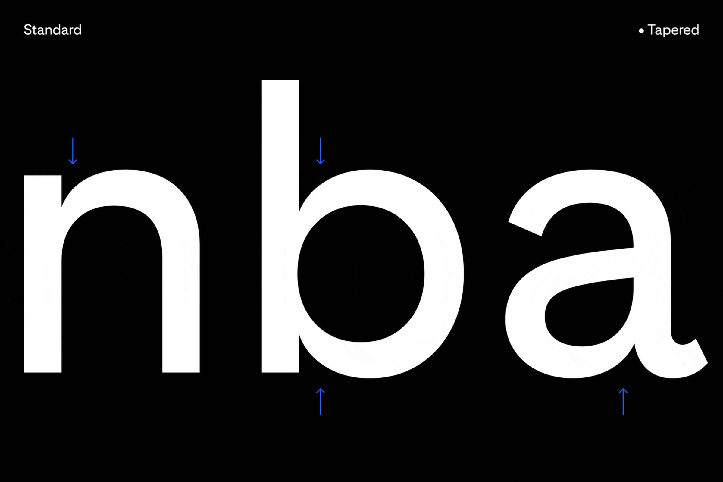
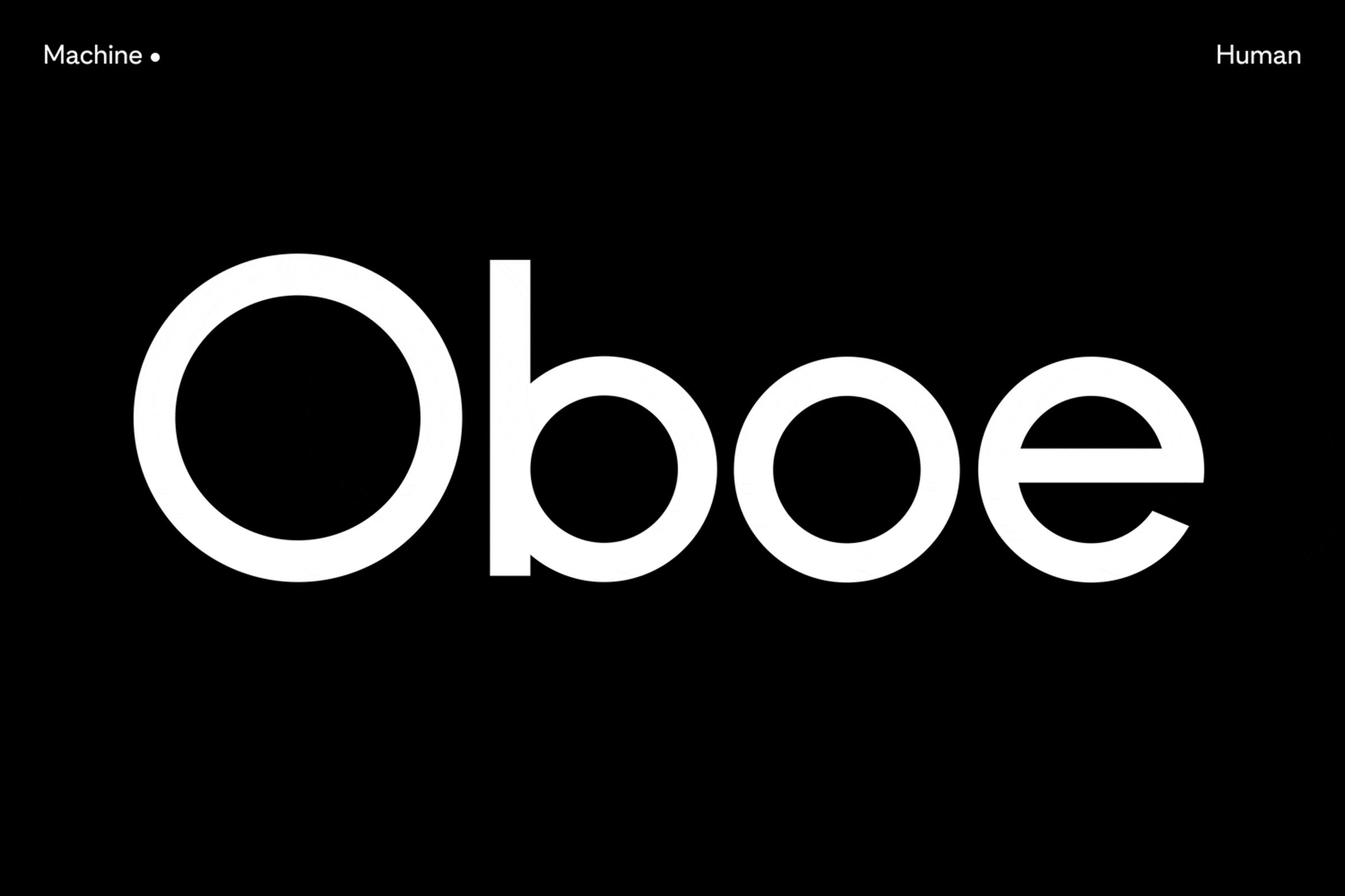
We carefully adjusted the details that would ensure the typeface’s compatibility alongside systems fonts. This required tailoring the vertical metrics, to ensure a consistent experience across a wide range of devices, browsers, and apps.

Leaning 8 degrees into the future
Central to Pinterest’s vision is making a platform for individuals to collect aspirations that look into the future. As a nod to moving forward, we drew an italic style that comfortably leans in 8 degrees. The italic style takes cues from handwriting—enhancing the human touch—and complements the upright style as its even more dynamic partner.

Different applications demand high flexibility
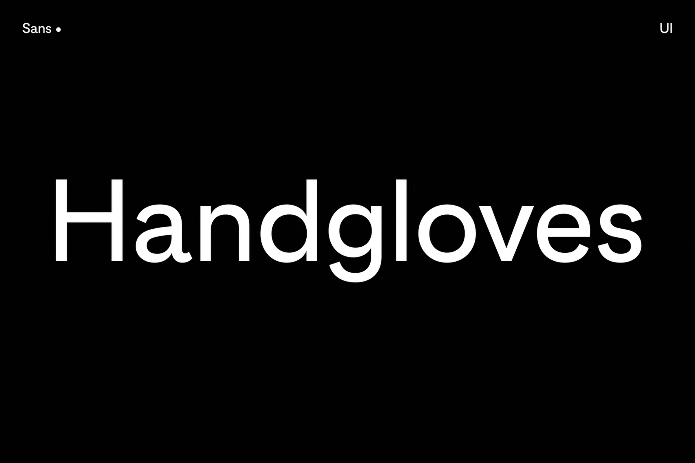
Pinterest UI—a separate version of the typeface—was created to ensure a consistent experience across multiple touchpoints. To increase legibility at smaller font sizes, a taller x-height was incorporated in all weights. The typeface also features vertically cut stroke endings that allow Pinterest to set text with tight spacing.
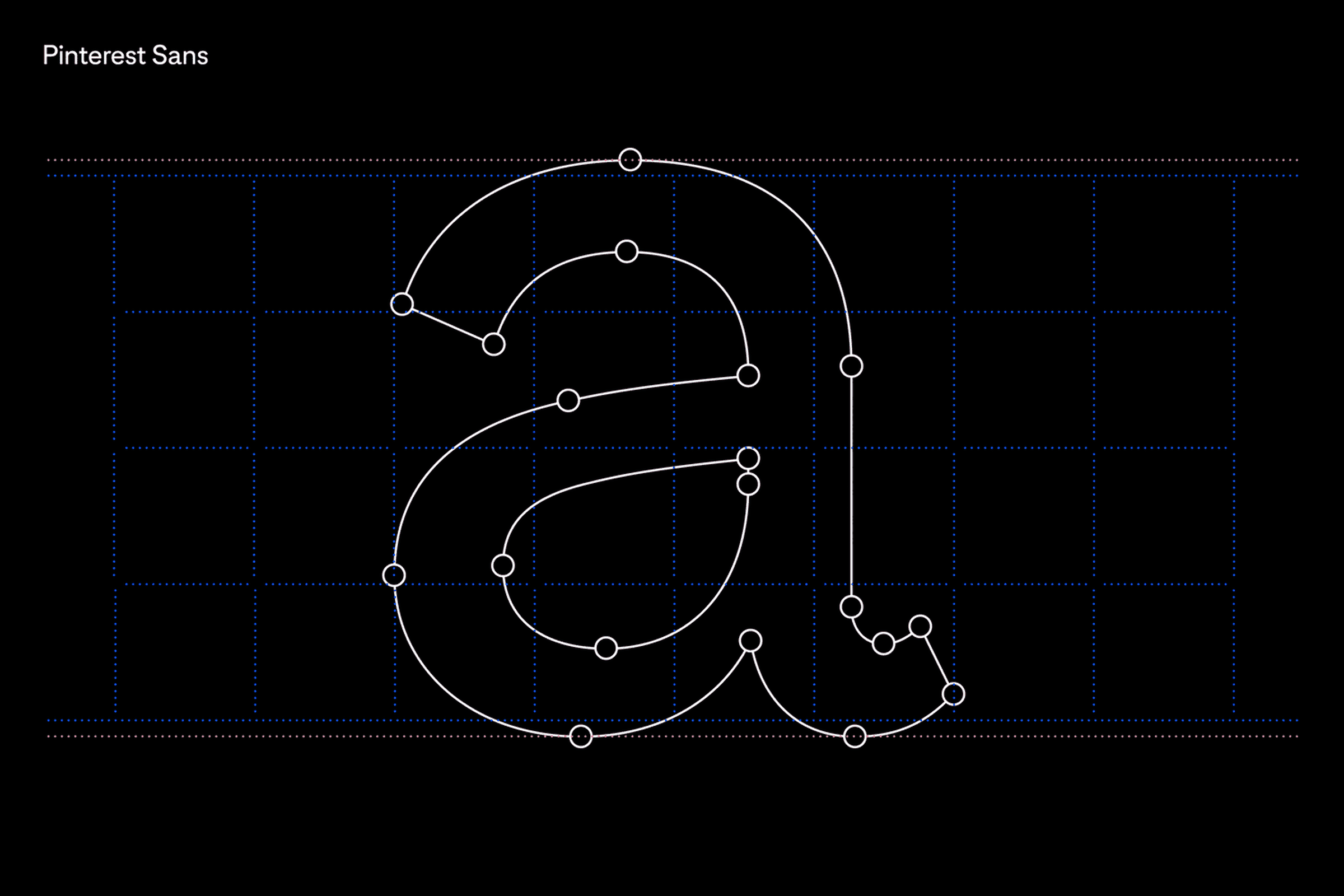
As a finishing touch, we introduced ink traps, which were historically used to avoid dark spots in tight areas where strokes meet. Ink traps were often used when printed ink on paper would disperse in small-sized text. We incorporated ink traps to enhance the performance of small texts on screens.

Introducing Pinterest Sans
Pinterest Sans gives Pinners a collective friendly voice that leans into the future. The final design balances handwritten qualities of calligraphic-inspired typefaces with the playful qualities of more geometric designs. The new typeface is the unifying building block for every brand touchpoint.
In order to support Pinterest’s users, who are located around world, to express themselves more fully, we are currently working on expanding the typeface to also support Cyrillic, Greek, Vietnamese, and Japanese.
There’s something magical with what people can do with simple foundations. On Pinterest, visual inspiration acts as building blocks for the next thing in life. It’s similar to how rudimentary shapes are used by children to imagine new worlds. We were curious how that intersection between geometric forms and human creativity might be captured within a typeface.


Sources:
Futura Alternates by Paul Renner (1927), from: Anatomy of a Typeface, Alexander Lawson, Hamish Hamilton, 1990
Avenir by Adrian Frutiger (1988), from: Adrian Frutiger – Typefaces: The Complete Works, Birkhäuser Verlag, 2008
Johnston Sans by Edward Johnston (1916), from: Klim Type Foundry, 2017, Flickr, Link

