Launched in 1995, Pitchfork is one of the most important websites for music fans worldwide. In 2015, the design team at Pitchfork approached us for a customization of our GT Walsheim – we called it Walfork – as well as the possibility of a custom-designed wordmark. Both would be used on their website redesign that was already in the works. Benefiting from an early inclusion into the design process, we used in-depth discussions with Pitchfork to define the challenge and figure out potential solutions.
- Wordmarks & Typeface2015–2017
- BrandingPitchfork
- Wordmark designGrilli Type
- Customized typefaceGrilli Type
- Customized typeface based onGT Walsheim by Noël Leu
20 years into their journey, Pitchfork had grown up. What had started as a website for a few album reviews evolved into much more than that – and nowadays includes industry and cultural news, the ability to listen to music directly on the site, and even long-form journalism. The wordmark was to reflect this growth in journalistic quality but maintain the rock and roll quality of earlier iterations.
We landed on a wordmark that references newspaper typefaces just as much as 70s music publications. Yet inside the simple, level-headed serif design, we made space for quirky details: the k works especially well to give the wordmark a memorable edge.


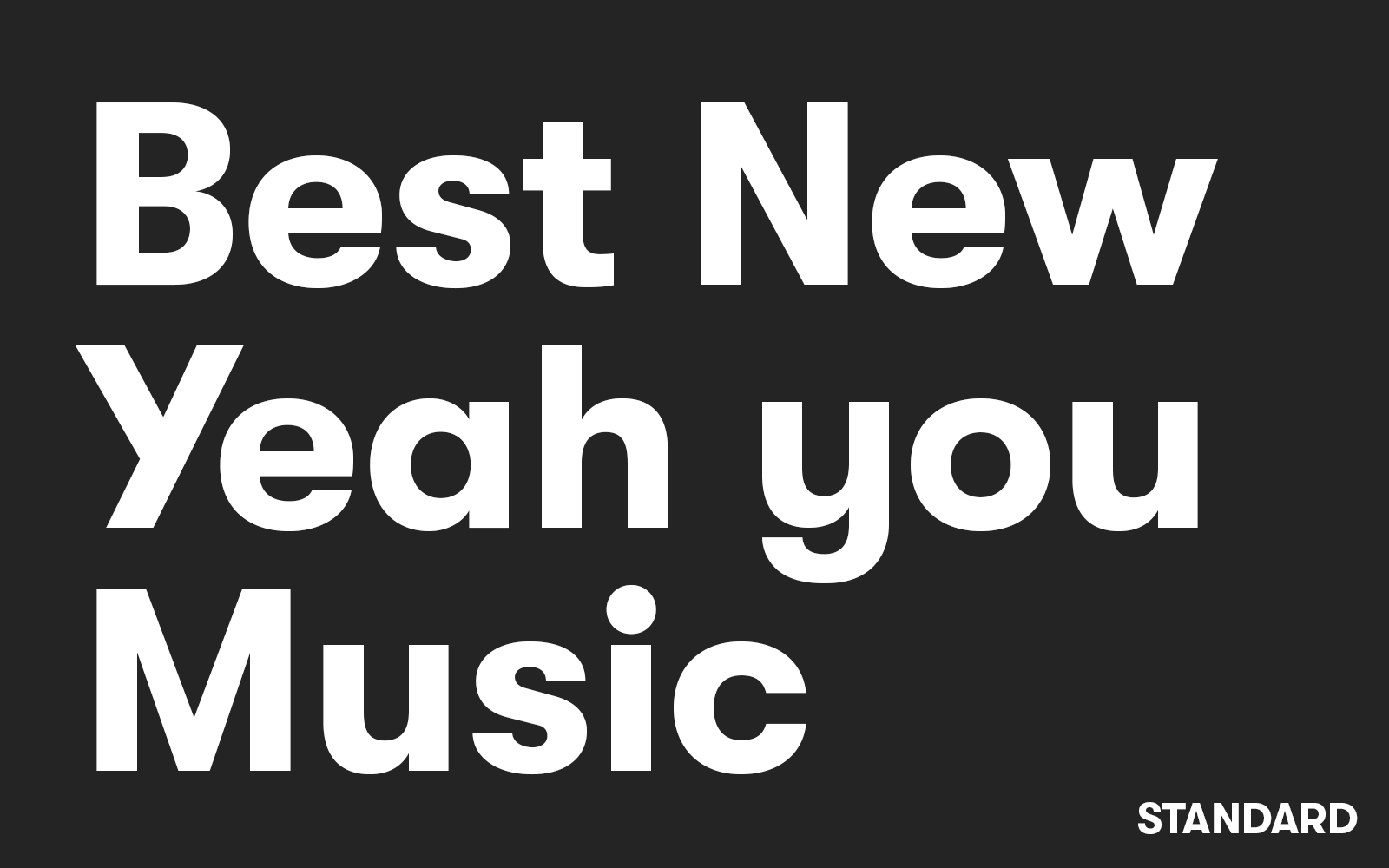
GT Walfork sports altered letters Y, a, s, and y that give it a more contemporary feeling. We also created customized weights of the typeface (Demi and Heavy) to match Pitchfork’s exact design needs.

Two years after our new wordmark helped Pitchfork relaunch their brand, they wanted to revamp the look of their two yearly music festivals in Paris and Chicago. A new wordmark was needed. We looked at our previous work for Pitchfork and realized that the solution was staring us in the face. Loosely based on that original work, we created sans serif lettering that echoed the main wordmark, yet stood apart and was more youthful and fresh. More party, less journalism.


The new wordmarks’ letters are a unique mix between sans and serif. We combined the high contrast between thick and thin parts, usually found in serif typefaces, with the straight-forward nature of geometric sans serifs. For the two festivals since we delivered our work, the design team’s applications have been outstanding. Colorful, inventive designs make the logo feel right at home.
