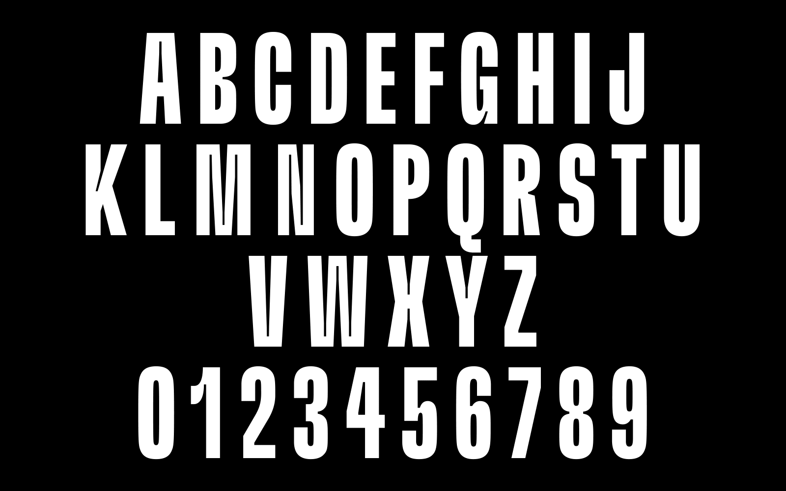
We customized GT Flexa for Riot Games mobile version of League of Legends, Wild Rift. DesignStudio needed an exciting typographic solution to complement the Esport brand’s new visual identity.
- Typeface Customization2021
- BrandingDesignStudio
- Images and Animations byGrilli Type and Design Studio
- Custom TypefaceGT Flexa WR by Grilli Type, Dominik Huber
In 2021 DesignStudio approached us for custom typography for a rebranding of Riot Games’ Wild Rift (the mobile version of League of Legends). The studio was looking for a customized version of GT Flexa to work with a fresh new visual identity.
Wild Rift’s Esports environment is fast-paced and action-packed, so GT Flexa would need to reflect the characteristics of the brand and its users. Already known for its adaptability and responsive design, GT Flexa provided a great starting point for the brand’s typography. DesignStudio imagined the type to be inspired by our gestures, designed to be stretched and distorted, giving the brand its distinctive look whilst requiring a minimal effort to use and adapt.
To achieve this, they proposed a type treatment to mimic the speed of Esports gamers—their quick decision-making abilities and even quicker fingers. What does speed look like? A rush of wind, a zipping race car, a flash of light—We aimed to capture this feeling of momentum in a way that would translate even if the type wasn’t animated.
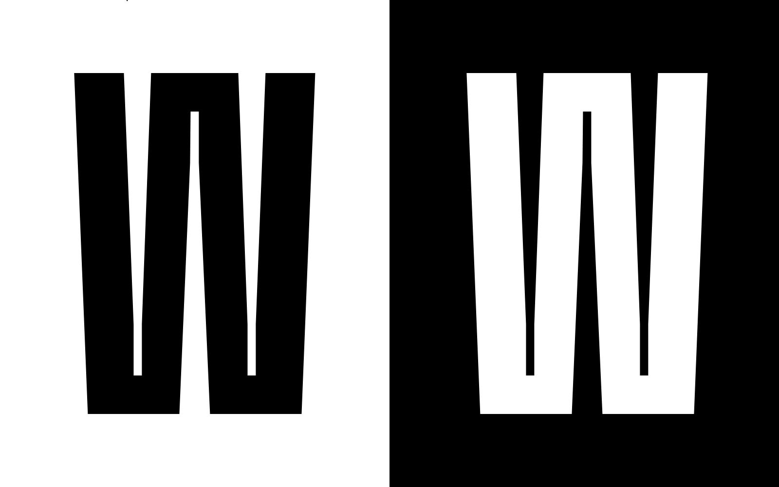
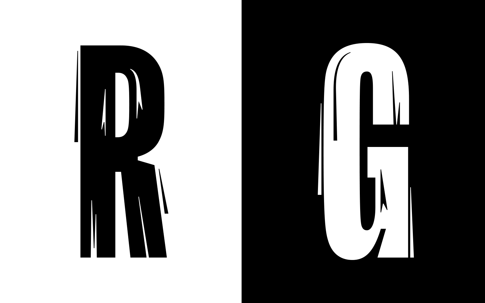
In our first approach, we added speed lines and cuts into GT Flexa’s letters to give the illusion of movement, and played with sight lines to exaggerate perspective and depth. The speed lines consist of pointed segments within the characters as negative space, and along the outside of the characters.
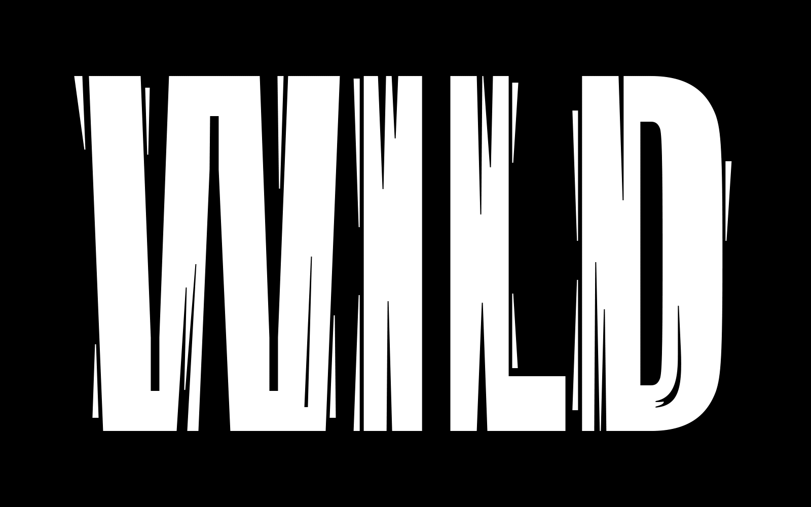
When applied to the Folded version, the speed lines become even more dramatic, and the tapered ends help create a depth effect. This resulted in a few alternates: GT Flexa WR Up, Down, and Fold. GT Flexa WR Up has lines to show upwards movement, and GT Flexa WR Down has lines to show downwards movement. Each version would be used to correspond with the action of the type—whether it’s moving into the frame or out of the frame.
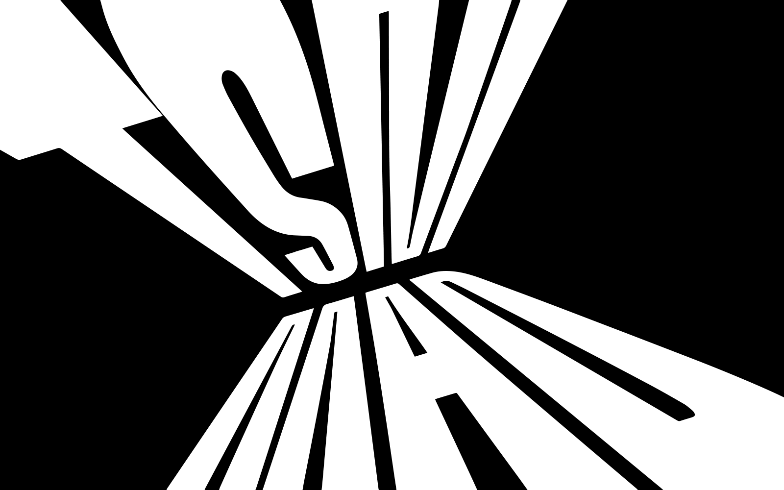
GT Flexa WR Folded combines both the Up and Down approach and pushes the type to a 3-dimensional space, intended for use on single word applications.
The biggest challenge in this design was finding a balance between intricate details and a working typeface. It couldn’t be too detailed, and the lines had to integrate seamlessly with the characters.
With feedback from DesignStudio, edits were made so that the interior speed lines did not compete with the main letterforms, or get too close to the counters, like in R and G in the Up style. Additionally, the exterior speed lines needed to carry an association with their letterform, so as not to appear random or unintentional. We worked hard to find a good distance between the speed lines and the characters to avoid them clashing when next to eachother.
This unique version of GT Flexa combines Grilli Type’s style with Esports action for the perfect Wild Rift type.