
We had a chat with Works about design, in-house rituals that spark creativity and Korean synth-pop music.
- Workswork-s.org
- SeoulSouth Korea
- Small studio2-10 people
- February 24, 2025
Images Courtesy of Works
- Grilli Type
How did Works come together in the first place? What was the vision behind starting the studio, and how has it evolved since then?
- Works
Yeonjeong – Co-Founder: We (Yeonjeong and Harim) were college classmates. Around the time of our graduation, we became deeply immersed in maker culture. Beyond just making things individually, we wanted to create a platform that could serve as a hub for this culture.
With that in mind, from 2012 to 2014, we ran WØRKS as a shop selling our creations, and from 2012 to 2018, we organized and operated GWAJAJEON, a festival where makers gathered to create and share snacks. Since graphic design was our primary tool for making as individuals, we decided to focus on it starting in 2014, evolving WØRKS into a graphic design studio.
Now, we’ve broadened our scope, aiming to integrate the positive effects that emerge when creative, alternative ideas meet professionals with deep expertise. We strive to foster a collaborative environment—both inside and outside the studio—where individuals can leverage their strengths, work joyfully and proactively, create efficiency, and experience both growth and fulfillment.

- Grilli Type
What’s a typical day like at your studio? Do you have any go-to tools or fun rituals that keep the team connected and creative?
- Works
YJ: The first person to arrive at the studio brews coffee. In the morning, we plan out the day’s work, and for lunch, we prepare a meal using healthy ingredients. The afternoon is dedicated to deep focus on individual projects. Whenever we start feeling stiff, we take care of the office plants or tidy up paper samples scattered around the studio. Sometimes, we take a tea break together.
As for rituals, we have two. First, we message each other on Warigari (a game where players pass a ball back and forth to score points). Harim and I are constantly engaged in a back-and-forth exchange of questions and answers, creatively connecting through our conversations. Whenever we come across interesting content, we immediately share it with each other—often things unrelated to our current projects. Even if the content isn’t directly tied to design, we keep exchanging messages, and we often find that these saved conversations inspire future projects. Of course, similar fragmented conversations happen in our team’s various messenger chats as well.
Second, food. We enjoy tea time with desserts and informal discussions, and when celebrating team members’ birthdays, we make sure to have a cake that’s both delicious and aesthetically pleasing. Food is always present at our important gatherings.

- Grilli Type
Typography is such a big part of your work—how do you go about picking typefaces? And what made GT Maru the right choice for Mameita?
- Works
YJ: We start by thinking about the message we want to convey in a project and who the target audience is. Choosing a typeface that effectively communicates with that audience is the most important part. We strive to select typefaces that not only deliver the message clearly but also evoke a shared sense of emotion. Once we’ve made a choice, we constantly question whether it was the right one by imagining how the typeface will exist in the real world.
GT Maru immediately came to mind. To explain in more detail, Mameita is a Japanese brush brand that has been developing its own techniques and expertise since 1991. As they prepared for their official launch in Korea, they entrusted us with creating their new visual identity.
We needed to design a Hangul logo that would be easily readable for Korean customers while maintaining Mameita’s existing aesthetic. We saw the rounded forms of Gulimche (Maru) as a visual element that both Korean and Japanese audiences could relate to.
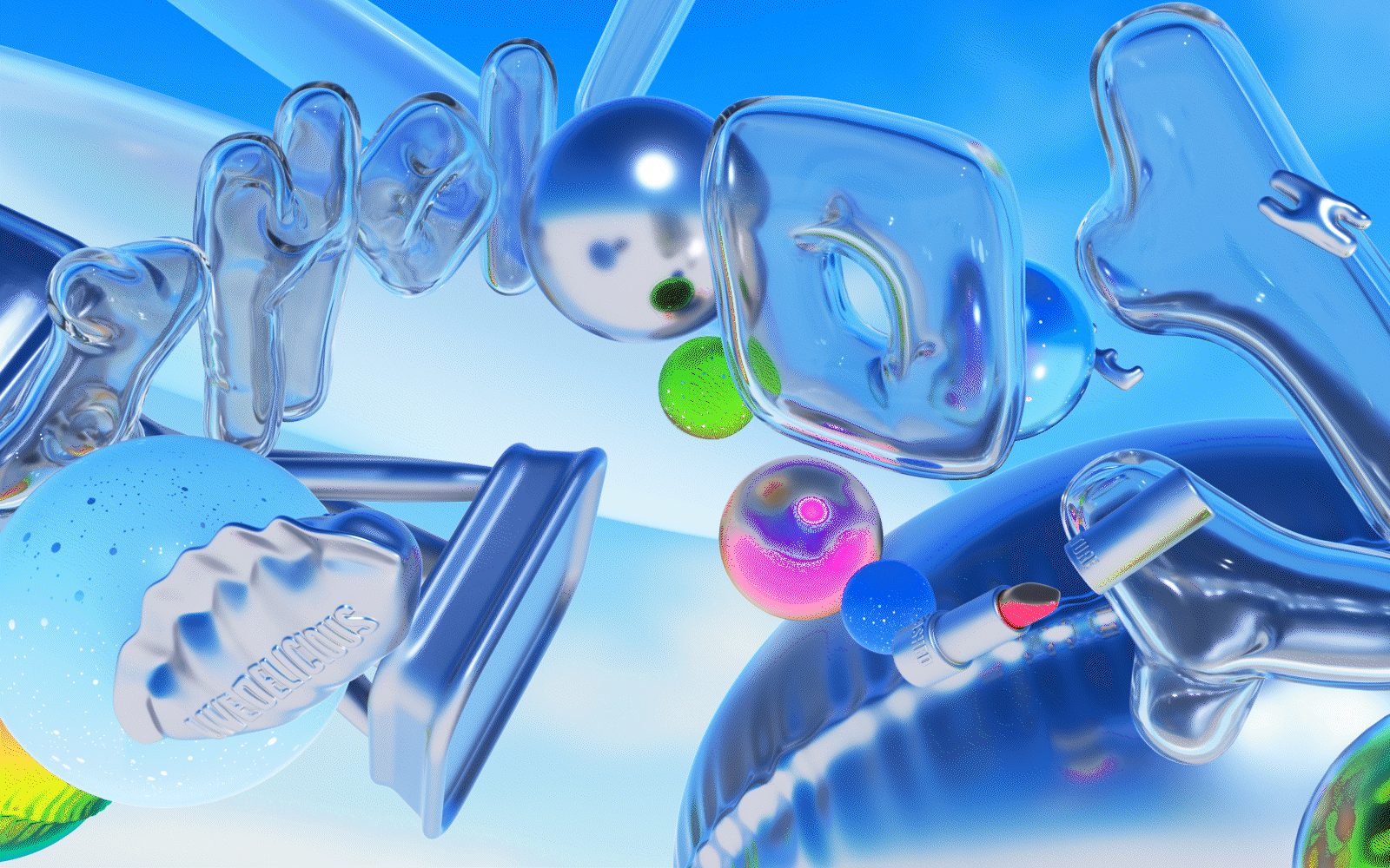
Mameita is a brand with a lot to say—mainly about the practical benefits of its wide variety of brushes. To encapsulate this characteristic in a visually effective way, we came up with the idea of using emojis. GT Maru’s rounded letterforms naturally led us in this direction, and we customized Mameita’s own set of emojis inspired by Maru’s style. Through emoji design, we were able to visually represent the fresh and clean feeling that comes from using Mameita’s brushes. Similarly, we used GT Maru as the foundation for rounded Hangul lettering, applying it to the logo and product names.

- Grilli Type
How competitive is graphic design in Korea, and how does that push you to constantly strive for improvement or find new creative solutions?
- Works
YJ: Rather than being unique to Korea, I think graphic design as a field is inherently competitive because of its accessibility compared to other industries. It’s relatively easy to enter, which makes the industry both dynamic and intense. But we see this competitiveness as a sign of vibrancy, and we genuinely enjoy being part of it.
- Grilli Type
What kind of mark do you hope to leave on the design world?
- Works
YJ: We hope to leave our working approach as a mark on the industry. When we participated in Documenta 15, we deeply resonated with an idea that was mentioned: “practical and romantic relationships? organizations?” We want to show that it’s possible to achieve professional success with a comfortable and joyful attitude, rather than just being intensely competitive.
We also hope that, beyond the design industry, our work can have a positive impact on the hearts of those who experience it.
- Grilli Type
Does this vision guide the types of projects you take on?
- Works
YJ: For our initiative work, we are planning a book project that explores our working approach. As for client work, we choose projects where we can have deep conversations with our clients. The best results often come when a project seeks us out because ‘WORKS’ is needed. In these cases, both we and the client, as well as the people consuming the final product, are often satisfied.

We always like to wrap up our studio portraits with a few fun links. Can you please share:
One image that we should look at:
Cats. While deeply immersed in work, I often feel like I’m losing touch with my aesthetic sense, but the moment I see an image of a cat, I instantly feel relaxed. Harim and I each live with cats, so their phones are filled with cute cat photos. All cats are always adorable. Cuteness is powerful.

