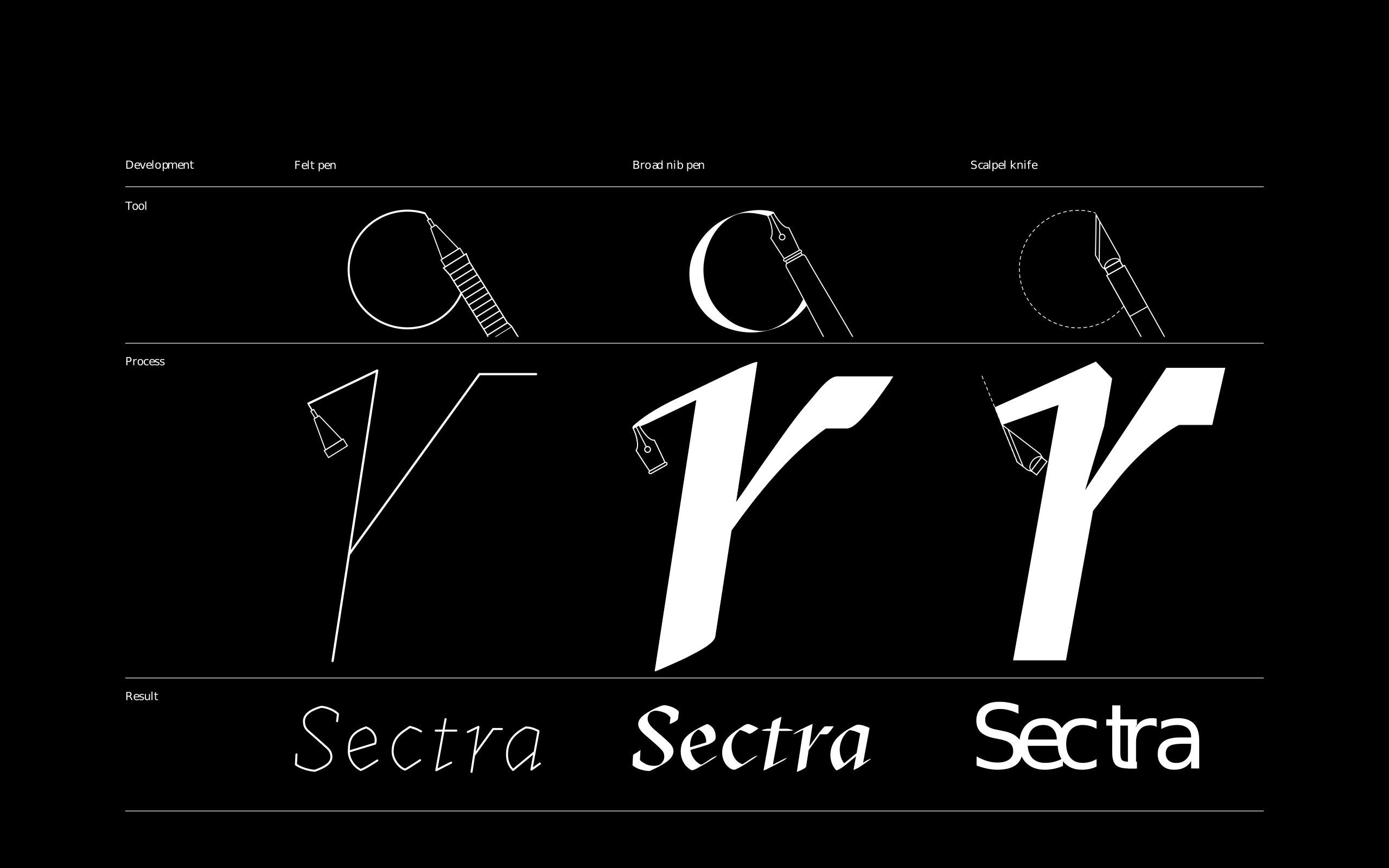
GT Sectra is a serif typeface combining the calligraphic influence of the broad nib pen with the sharpness of the scalpel knife. This sharpness defines its contemporary look. The family stands out for its high legibility while retaining a unique visual character.
The GT Sectra subfamily was originally designed for the long-form magazine “Reportagen”, a publication with interesting stories from all around the world. The Zürich-based studio Moiré designed the magazine and since it was text heavy, the typography was central. In order to convince possible investors, they first designed a pilot issue of Reportagen. For that purpose, Times Bold was used for headlines and a typewriter typeface for texts. After receiving funding, form was given a higher role and a first beta of GT Sectra was designed and implemented in both text and headlines, giving the magazine a distinct and consistent look. The typeface serves primarily the content, but on another level also as the base of the magazine’s visual identity. This is especially prominent on the cover, which is purely typographical, accompanying a single small illustration.
Reportagen: From mockup to final design The mockup of Reportagen of a serif typeface for headlines and a monospaced for text. The final design features the first beta of GT Sectra.
One of the first visual inspirations for Sectra was blackletter. A lot of the design features that make the drawing edgy, were incorporated in the typeface’s design.
The idea was not to reproduce any historic typeface, but to translate those ideas in a more contemporary design. The proportions of the letters are more pragmatic than with classic serif models, with the x-height and weight of the capitals closer to a Grotesque than classic serif typefaces. The capital letters are also kept relatively narrow to better integrate them with the lowercase in body copy. The weight of the Regular style is relatively dark, pre-empting contemporary offset printing technology, which adds only minimal weight gain.
The design idea was to start with truly calligraphic letters, but translate those into simpler, more straightforward shapes. The cuts in the curves add tension and strengthen the feeling of sharpness of the typeface. The arch in the “n” for example is not rounded but cut. The drop of the “a” has also a square shape and cut curve.
Taking a closer look at the pathing of the individual glyphs, reveals how the sharpened look of the design was achieved: Straight lines and kinks at the extreme points give the typeface its distinctive look.
The eye-catching cuts also inspired the typefaces name: Sectra is derived from the Latin for cutting, “Secare”.
The typeface went through many iterations since its inception in 2011. After creating the first beta version, Moiré joined forces with Noël Leu from Grilli Type to sharpen the concept of Sectra. The typeface was improved upon with every issue of Reportagen. At first the design had a softer and more traditional feel. Bit by bit, curves were replaced by cuts, forcing the design into having a clearer attitude.
The italic emphasizes the calligraphic influence. Traces of continuous handwriting with a broad nib pen are even clearly visible in the uppercase letters. An interruptive stroke was used to prevent the typeface from looking too humanistic and to emphasize the strong angular lines.
During the creation of the original version the team felt there was still design space to explore to make Sectra even more versatile. The initial version of Sectra lacks strong dynamic with its very low contrast. Its text color is rather dark and the low contrast combined with ink traps lets it perform even in very small sizes. Sectra Fine, on the other hand, has a higher contrast and gives the typeface a more elegant feeling. It serves as a well-matched headline companion to Sectra but can just as well stand on its own. Sectra Display takes all the design features to their most extreme, getting rid of curves wherever possible. The lowercase “r” for example is purely angular and does not contain any curves. Combined with a very high contrast and a more condensed design, this subfamily becomes truly eye-catching at larger sizes. Its weights are are also more polarized, with the extreme Light and Super weights not found in the other subfamilies.
All sectra subfamilies with ten weights and various OpenType features. A compact ascender and descender feature was added to allow for great performance even when very tight line spacing is used – for example for headlines.
This all comes together to form a large, coherent family that allows for a wide variety of uses. A serif typeface, more than any other, nowadays has to be a tool that performs in large and small, on coarse paper or the dense pixel grid of mobile devices. The GT Sectra family, with its three distinct but related subfamilies, does all that and much more – and excels in these conditions. We’re excited to see where it will show up next.
- TypefaceGT Sectra
- May 6, 2015
- Explore GT Sectra


