Inspired by the Pantheon in Rome, GT Pantheon features three archetypes—Micro, Text, and Display—crafted for size-specific precision. Balancing elegance, functionality, and brutalist influences, it’s a modern typeface rooted in timeless design.
- January 1, 2026
Part I
The Pantheon in Rome is one of the world’s most prominent buildings, known for its exceptional architecture. Conceived as a temple ‘of all the gods’, then turned into a church seven centuries later, it combines architectural elements of different eras. According to some historians, construction began around 114 BC under the rule of Trajan who is better known in the world of type for the Column built in his honor, but mainly for its inscriptions that many consider the epitome of Roman capitals. The inscriptions on the Pantheon’s portico are younger, while much of the lettering and art displayed inside it were crafted during the fifteenth century. GT Pantheon is not derived from any of these inscriptions, but just like the long history of the building, the new typeface was conceived in the spirit of different faces that are built on the same ideals.
The Miriam and Ira D. Wallach Division of Art, Prints and Photographs: Art & Architecture Collection, The New York Public Library. (1682). Élévation de la face du Panthéon à Rome. Retrieved from here

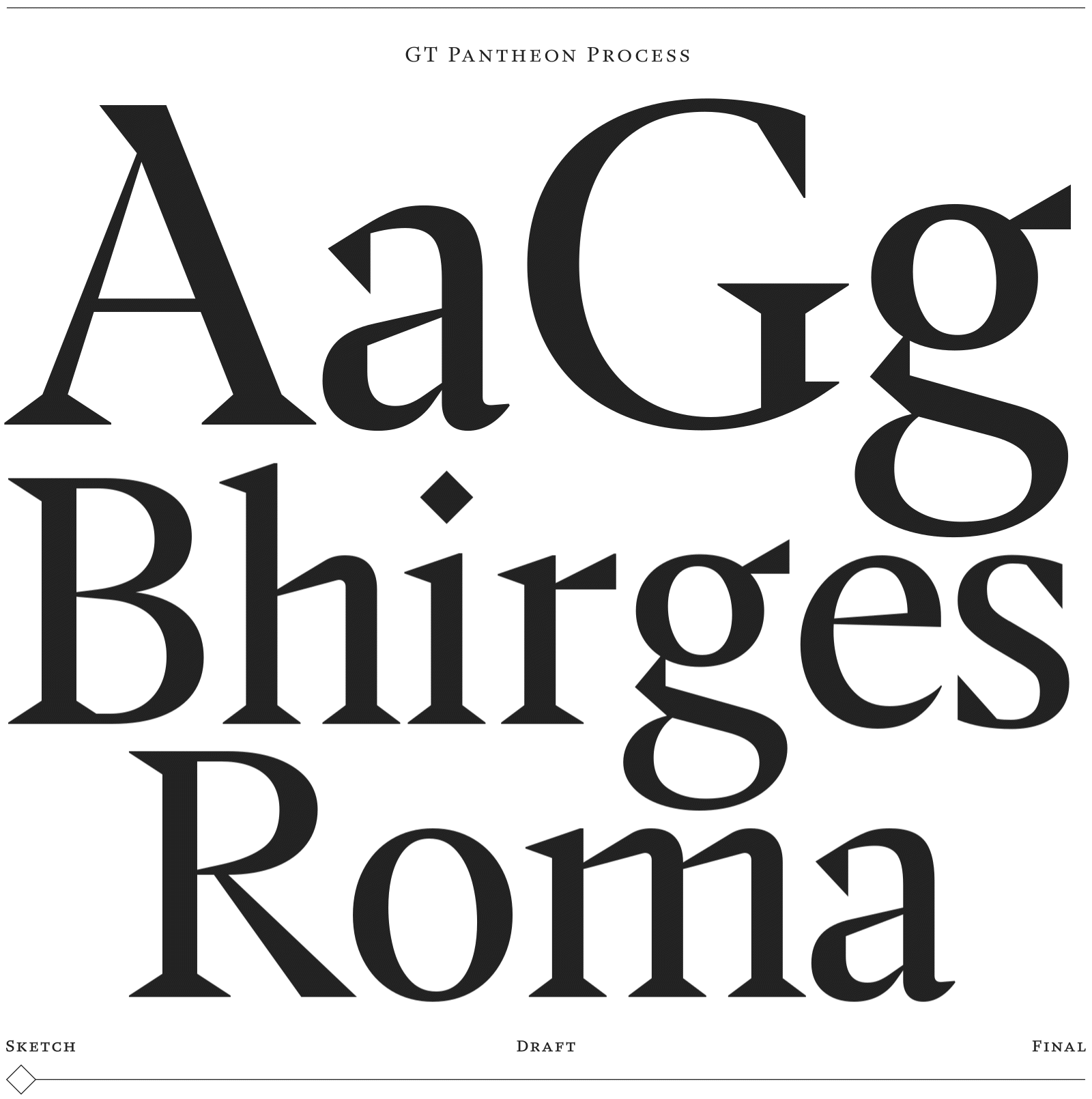
GT Pantheon began with a spark and was subsequently refined in a careful design process. Upon a visit to the Pantheon in 2020, Tobias began working on a new typeface design that would take inspiration from architectural structures such as letterform constructions best described as ‘brutalist’. As Noël was working on a similar theme around the same time, he suggested they join forces to discuss conceptional ideas. Their collaboration allowed them to explore the balance of aesthetics and functionality as well as appearance change in relation to size.
The design process was a journey of constant refinement, with a great deal of sketching used to sculpt the shapes over time. Throughout the process, test sheets and notes were passed between Tobias and Noël, both digitally and on paper, enabling an ongoing exchange of thoughts and feedback. Several different versions of the typeface were developed from start to finish, each one sharpening the concept further, ultimately leading to the creation of GT Pantheon as it is today.
Part II
At the core of GT Pantheon is the conception of three archetypes, essentially three faces of different expression, each designed to best represent the same type in a recommended range of sizes: Micro, Text and Display. Few aspects of type manufacturing have undergone as much change during the twentieth century as that of character sizing; each technology had a significant impact on its original concept. In the era of manual punch-cutting, letterforms were optically adjusted for every available metal type size: while smaller sizes require a larger x-height, enlarged counters, slightly heavier strokes and overall more generous spacing, larger sizes tolerate much tighter fitting and higher contrast between thick and thin strokes.

In phototype-setting a single matrix could be used for the same range of sizes, enabling linear scaling as opposed to optical scaling, although some manufacturers supplied matrices for two or three different size ranges. GT Pantheon follows this principle: in a side-by-side comparison of Micro, Text and Display all of the optical adjustments mentioned above become visible and exude the true character of each archetype.

GT Pantheon Display is an elegant high-contrast face, emphasized by an overall sharp appearance and wedge-shaped pointed serifs, some of which guide the eye while reading — like a colonnade of Corinthian columns. Its transitions from thin to thick and from bows into stems are almost reminiscent of letterforms chiseled in stone [2.3]. In order to maintain this posture in smaller sizes, it was necessary to compromise on the pointed characteristics without losing the overall sharpness.

On the other side of the optical size axis, GT Pantheon Micro is warm, durable and equipped with a significantly large x-height that lends it a strong presence in any paragraph. The wedge-like serifs are slightly flatter and thicker to withstand the challenges of ink and light in small sizes. Sharp elements are vertically and diagonally filed, a change in shapes that supports the overall low stroke contrast, while preserving GT Pantheon’s anatomy.

Traditionally, metal type sizes ranging from 6 point (captions) to 96 point (titling) were modeled around a primary intermediate pilot size that some consider the heart of a typeface. The opposite is the case in GT Pantheon: while it is the extremes that must be regarded as the true faces of the type, the intermediate Text is the result of negotiation, where Micro and Display meet halfway.
Part III
The shape transitions from one archetype to the other have significant implications on GT Pantheon’s change of character. With an increase in size, the typeface not only exudes elegance, but also reveals its expressive nature, a detail that is illustrated in the capital ‘B’: from Micro to Text and from there to Display, the stroke of the upper belly sinks into the lower bow in an almost Jugendstil-like manner.
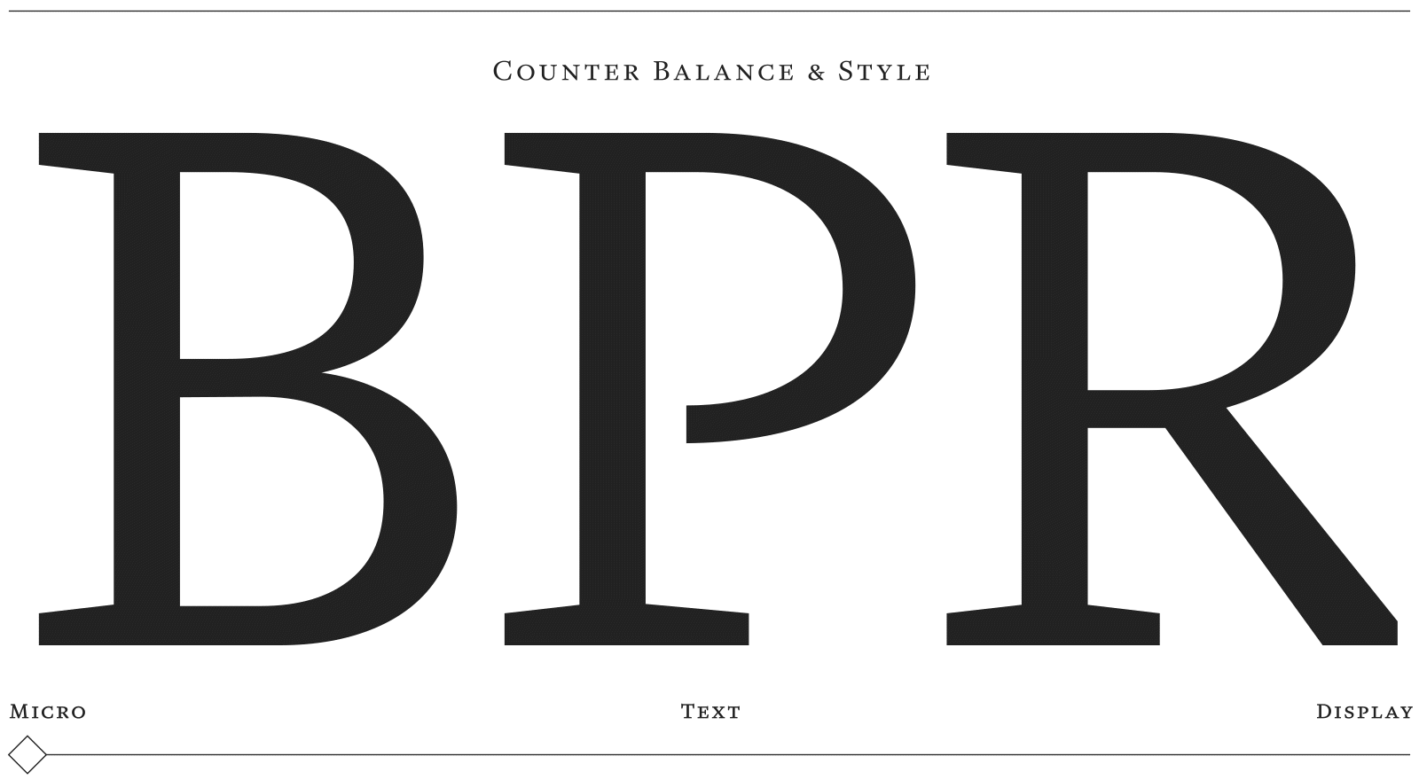
Remains of Tobias’ early ‘brutalist’ explorations are visible in the slightly affected capital ‘J comma Q y’ and in the serif-less legs of ‘K’ and ‘R & k’, adding to Pantheon’s effusive side.


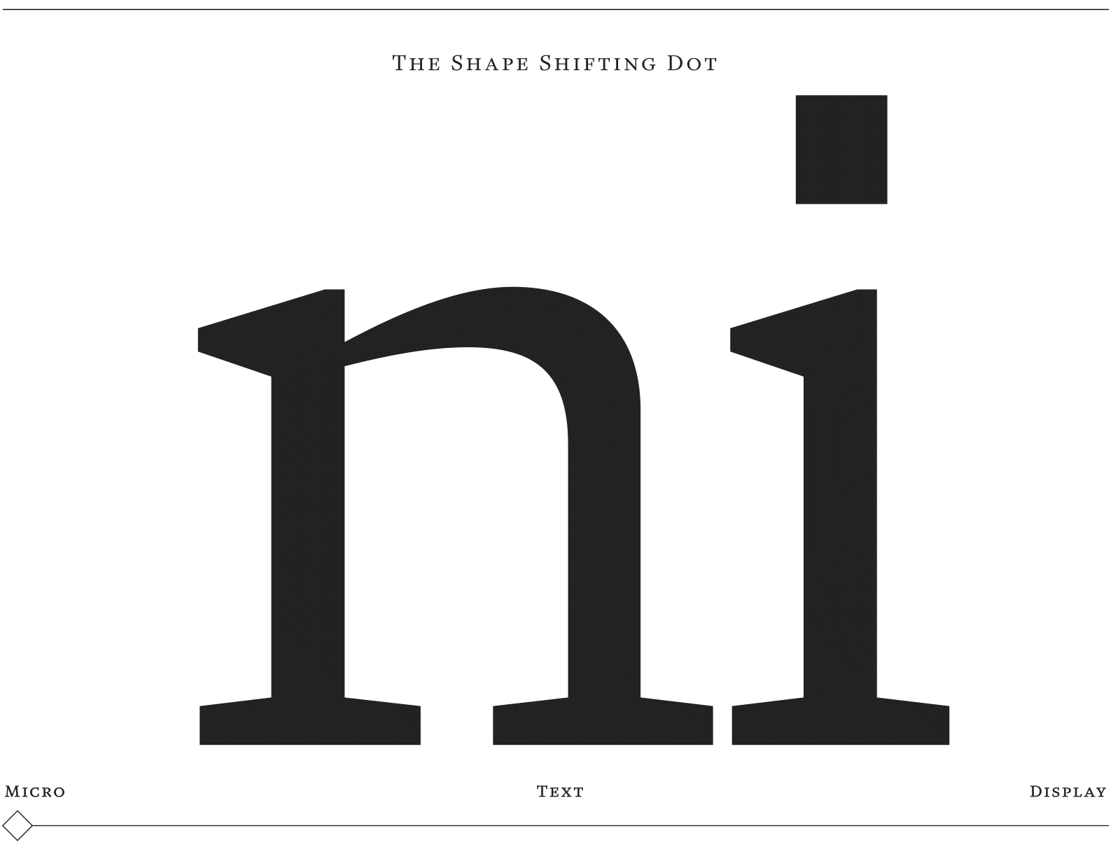
A much less expressive, but subtle shape shifter is the dot of the ‘i’. While it floats on the stroke in diamond shape in Text and Display — with the potential of a signature element —, it is rectangular-shaped in Micro and transforms to a trapezium in its italics.
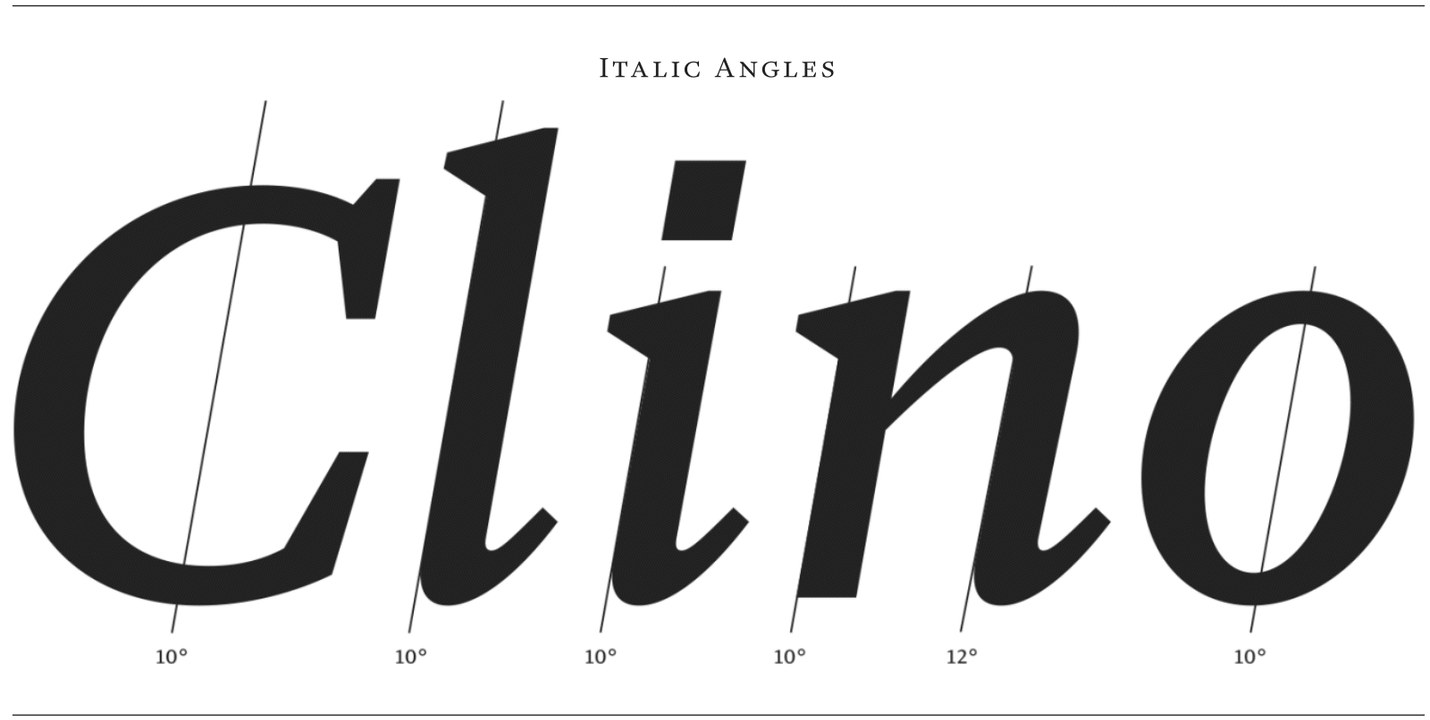
The italic styles of GT Pantheon are ‘independent companions’, they are not silent, but not obtrusive either, and again, their character varies with each archetype. In a typographic lesson of optical size adjustment, the angle of inclination increases from Micro to Display in the appropriate amount for each range of sizes.
Although GT Pantheon represents a truly digital design architecture, its appearance is heavily informed by numerous drawings and rough sketches from hand at each stage of the design process.
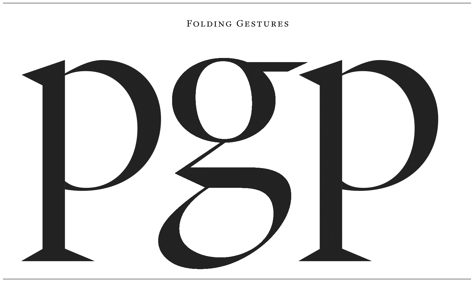
This characteristic results in carefully crafted strokes, such as in the lowercase italic ‘g’ that looks as though it has been conceived in one folding gesture. These moments of folding strokes are repeated in several other lowercase character.
In the metal type days, many of the size-related design decisions mentioned above would have been forever manifested in the respective sizes, but with digital outline description all of these archetypical considerations remain mere recommendations.
GT Pantheon is a testament to the fusion of tradition and innovation, where each optical archetype — from Micro to Display — combines architectural heritage with the needs of modern design. This typeface reflects typography’s evolving relationship with scale, form, and function, while embracing the flexibility of digital design.

With every detail and adjustment, the typeface demonstrates how adaptable and expressive type can be, offering a fresh take on timeless design.
GT Pantheon offers 30 styles across five weights and italics, plus a variable font. It’s now available for licensing on our website. Be sure to check out the minisite to explore its world.
Written by Ferdinand Ulrich