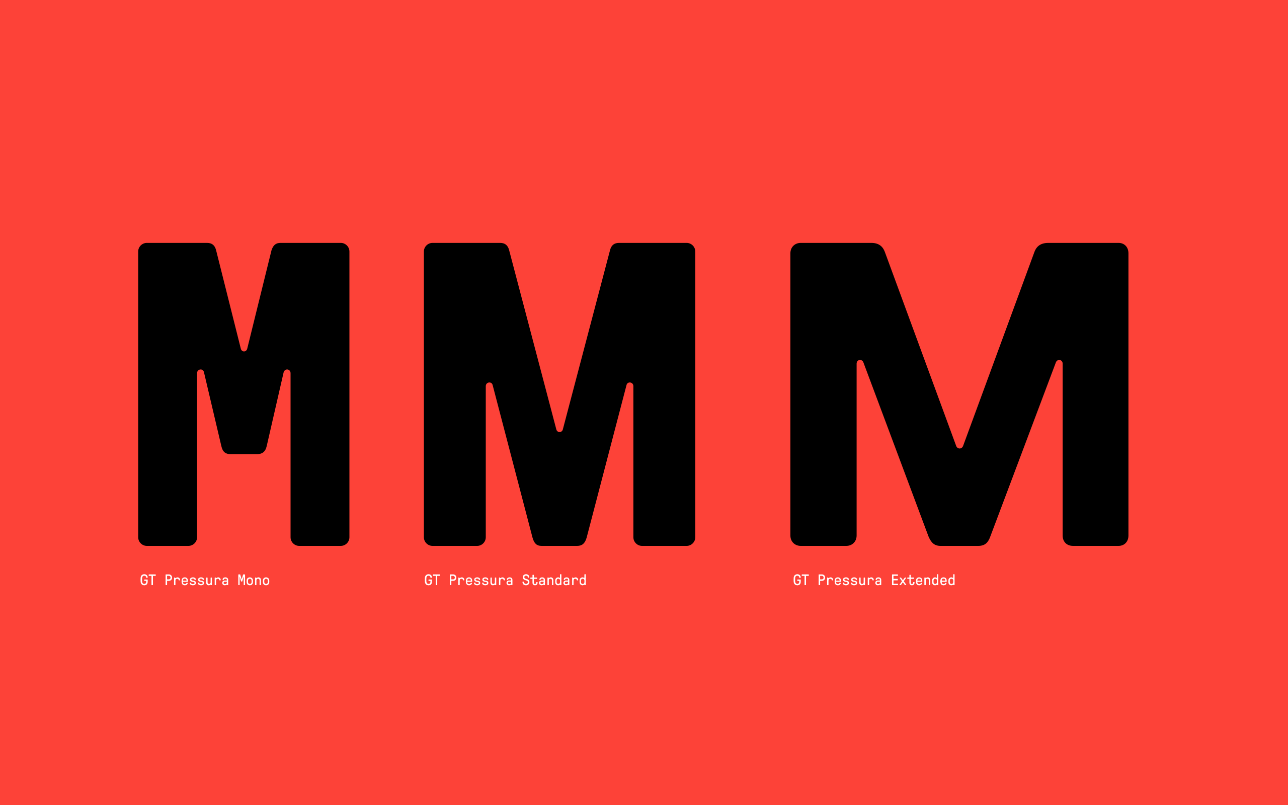
GT Pressura was first released in 2012, Cyrillics were added in 2017, and now a 2022 refresh adds three new weights and an entire new width to the typeface.
- December 5, 2022
Constructing History
As print designers by trade, Marc Kappeler and Dominik Huber of Moiré have a familiarity with the tensions presented between physical and digital mediums. In 2008 they took on a book project about conceptual art in Moscow, and found that it needed its own typeface to get the design vision just right—and this began GT Pressura’s design.

The book, Total Enlightenment: Conceptual Art in Moscow 1960-1990, chronicles this turbulent period of Russia and the artists who used conceptual art to process the political climate they lived through. As the artwork in this book references early twentieth century artistic styles, so did Moiré when looking for visual inspiration for the typeface. They referenced the work of Suprematist and Constructivist artists (whose radical aesthetic for the time was eventually met with Soviet opposition) for their mastery of constructed, geometric design.

Constructivist artists saw their art as reflections of the modern industrial world, and this industrial aesthetic can be found in GT Pressura. Toss in a little typographic history, and now you’ve got the makings for a well-defined typeface. Aside from its art historical references, GT Pressura also recalls the process of hot metal typesetting and the pressure of the metal and ink that result in printed type. The typeface uses the visual gesture of ink spreading under pressure as a stylistic device, embracing analog techniques within the details of its design.

Under Pressure
The typeface’s form is rooted in action, highlighting the typographic product that is created by the pressure of a printing press—a completely new shape emerging from rounded corners and unpredictable imperfections. Type designers have embraced changing technologies, eventually bringing HiFi versions to the screen that were skinny, sharp, and extremely polished. GT Pressura recovers those warm characteristics of analog design and optimizes them for the digital age.
In the process of construction and then digitalization, Moiré explores the abundance of space on the web with a medium once confined to the boundaries of print. The design becomes liquid again, transferred to the screen in a nostalgic kind of way that is committed to the original intentions of typesetting. Think Daft Punk on vinyl, or a light dusting of film grain over The Matrix—anachronistic, yet self-aware and timely.
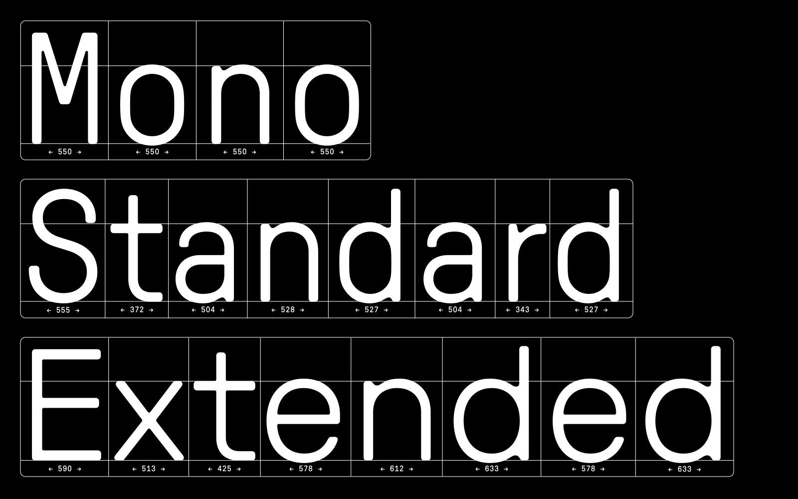
So what’s different this time around with the new, refreshed version? Dominik says, “We have left the style of the font as it is, which is important for the character. Now the range of weights has increased in order to increase the possibilities. The spacing has changed fundamentally. The white spaces now correspond better to the letters, descenders have been shortened—this makes the font even more efficient and practical.”
GT Pressura, Extended
This update also introduces a new Extended width of GT Pressura. While working on the book Brasiliana: Installations from 1960 to the Present, Moiré found that they needed a typeface with a more organic rhythm. Something less strict in construction and more easily digestible. The book was also much larger than the project that originated GT Pressura, so a wider typeface would be required for the design space.
A more relaxed reading experience with the type called for an increase in character width and a decrease in the number of characters per line. This is where GT Pressura took on more Swiss-Style characteristics, and becomes more elegant, Moiré says. Extended has the proportions of a modernist grotesque typeface with completely mechanical design details.

Moving Parts
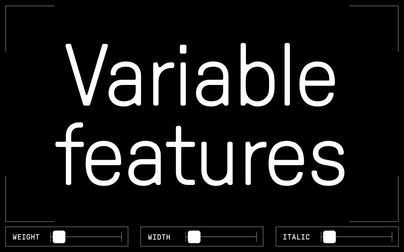
The effort to increase GT Pressura’s flexibility and usability lands us in variable font territory. As part of the 2022 update, GT Pressura can now occupy new weights, plus all of those in between. It was a natural progression for a typeface that strives to be a contemporary typographic solution. Marc gets into the details: “All curves have the same radius on all cuts. The geometry always remains the same. The idea: the ink behaves the same in analog printing, whether black or light. This comes into its own with the variable font.”
We also collaborated with some type friends of ours to expand GT Pressura’s language support. The Standard GT Pressura encoding now supports 196 Latin-based languages, and has a Vietnamese add-on, created in consultation with Donny Truong. Cyrillic’s newest version features a re-worked character set developed in consultation with Anya Danilova, and the Greek script was made in consultation with Vassilis Georgiou to get the details just right. For any Chinese, Japanese, or Korean type needs, there are matching fonts via Type Project (Japan), Sandoll (Korean), and Arphic (Taiwan), expanding GT Pressura’s cultural reach, too.
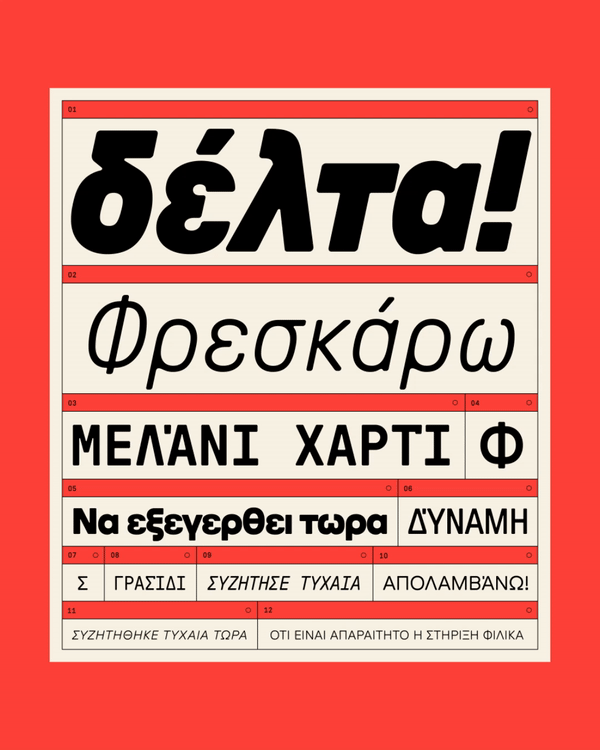
Typeface designed by Dominik Huber and Marc Kappeler (Moiré)
Script extensions byDominik Huber with Grilli Type
Consulting by Panos Haratzopoulos (Greek) and Donny Trương (Vietnamese)

